Quick Summary: Service firms should plan their websites in four sequential steps: define audiences and success metrics, map a clear sitemap with essential pages, specify accessibility and privacy requirements like WCAG 2.1 AA and CCPA, then test and maintain the site regularly. Most firms skip planning, which leads to confusing sites, but a structured approach ensures visitors understand the services and can contact the firm within two clicks. Ongoing maintenance is critical since outdated plugins cause most hacks, and managed plans can handle updates for busy owners.
Picture someone comparing three local accounting firms. Within seconds, your corporate site should show what you do, why you’re credible, and what to do next. Most service firms skip the planning step, so their sites confuse visitors instead. This guide walks you through a simple, sequential plan covering content, conversions, accessibility, privacy, and upkeep. Monkey Business has built secure, compliant websites for California small businesses and nonprofits for years, and this framework is how every project starts.
Step 1: Define the Audience, Purpose, and Success Measures
A corporate site fails when it tries to please everyone. Content built for “anyone” connects with no one, a point UW-Madison’s web team makes plain. So name your visitors, what each should do, and how you will know it worked.
Turn Business Goals into Visitor Tasks
Start with your business goal, then translate it into a task a visitor can complete.
List your audiences. A law firm might serve clients, referral partners, and job seekers, as Inc. notes.
Pick one main action per audience. Book a consultation, download a guide, or call your office.
Set a number. Example: 10 consultation requests per month from the corporate site.
Write these down before touching layouts or colors. They become your filter for every later choice.
Business owner mapping visitor tasks on whiteboard
Step 2: Map the Site Structure and Essential Content
Build a Clear Path from Homepage to Contact
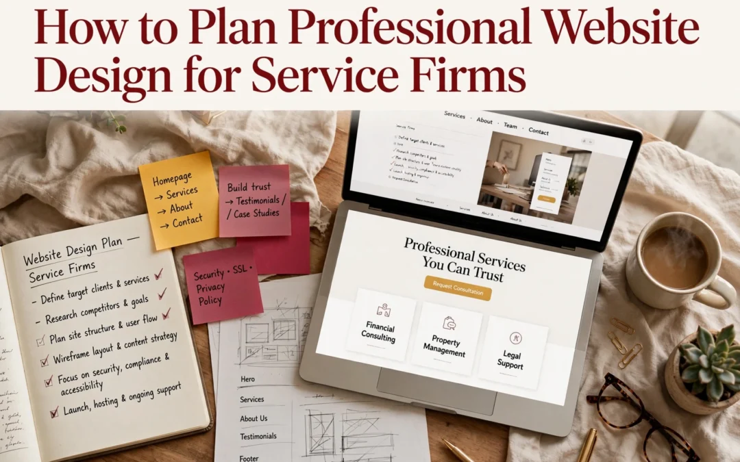
Your sitemap is a simple list of every page, grouped by topic. Start broad, then break big ideas into focused pages. The SBA lists the essentials: a homepage, an About page, a services page, and a contact page with your phone, email, and hours. Add testimonials and an FAQ if you have the content for them.
Keep the path short. A visitor should reach your contact form in two clicks or fewer from any page. Put your main menu items in the header, repeat key links in the footer, and name pages the way customers talk (“Estate Planning Services,” not “Our Solutions”).
Rule of thumb: if a page doesn’t answer a question a real client has asked, cut it or merge it.
Step 3: Specify the Design, Accessibility, and Functional Requirements
Plan for Usability, Accessibility, and Privacy
Your site must work for everyone who visits it. The ADA applies to businesses open to the public, so the Department of Justice recommends building in basics like strong color contrast, alt text on images, and keyboard navigation. Many firms use WCAG 2.1 Level AA as their target.
Requirement
What to Specify
Accessibility
WCAG 2.1 AA, alt text, keyboard access, readable fonts
Privacy
CCPA notice, cookie consent, secure forms
Function
Contact forms, booking, mobile speed
Automated overlays cannot fix everything. A “clean” scanner report does not mean your site is accessible, so build it in from the start.
Write each item into your project brief as a checkbox. This keeps designers and vendors accountable.
Test before you launch. Check every form, link, and page on phones and desktops. Run an accessibility check, then confirm your privacy policy and cookie notice work as required.
Fix broken links and typos.
Confirm contact forms reach your inbox.
Set up backups and security updates.
Then keep going. Maintenance is not optional: only 14% of WordPress sites run the latest patch, and outdated plugins cause most hacks, according to Censys research reported by Cybernews.
A site that sits untouched becomes a soft target within months.
If you lack time for updates, a managed plan handles it. Monkey Business includes hosting, backups, and updates in its service, so maintenance never falls off your list.
Homepage
Ready to skip the planning headaches? Monkey Business handles design, hosting, maintenance, and compliance for you. Visit us today.
Frequently Asked Questions
Q1: Best professional website design for service businesses?
A done-for-you service like Monkey Business: design, hosting, compliance, and upkeep handled for you, so you focus on clients.
Q2: How much should a small firm budget?
Most service sites run $2,000-$10,000 upfront, or a flat monthly WaaS plan.
Q3: How long does a redesign take?
Typically four to eight weeks with prepared content; longer if you start copy from scratch.
Conclusion
Good planning turns a website into a working asset: define your content first, design for conversions, then bake in accessibility, privacy, and ongoing upkeep. Design drives credibility, with 50% of consumers judging a business by its site, so plan every piece together.
Quick Summary: Professional website design beats DIY templates for businesses that need trust, custom branding, or hands-off maintenance, while templates suit simple sites on tight budgets. A DIY site costs $10-$50 monthly but eats 40-100 hours of your time and often adds $500-$5,000 yearly in unplanned upkeep, whereas a managed service like Monkey Business bundles design, hosting, and support into one flat monthly fee. Nearly half of visitors judge credibility by visual design alone, and one in three local businesses lack a healthy site due to neglect, so done-for-you services prevent that decay. Choose a template for quick, cheap launches, but pick professional design if you need growth, compliance, or zero backend work.
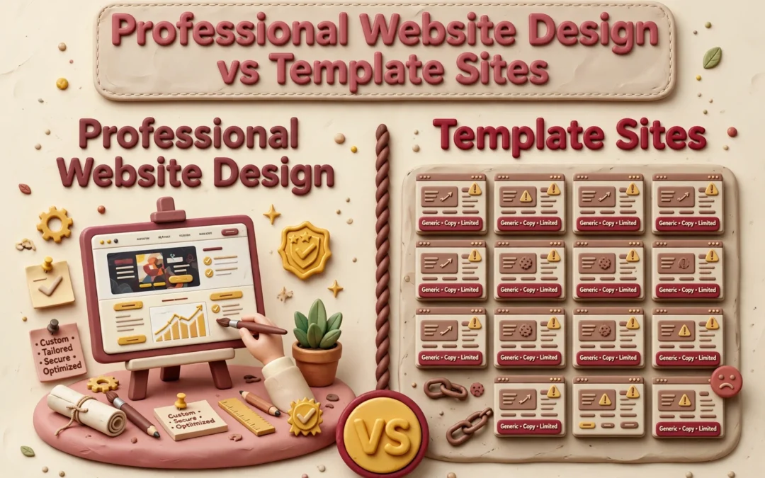
When your California business runs on trust, professional design beats a template. Professional design reflects your brand and stays cared for; a template suits a simple site you maintain yourself. A DIY launch saves money upfront but costs time later. Below, we compare fit, lead flow, ownership, and total commitment.
Professional Website Design vs Template Sites: At a Glance
A tailored design and build service shaped around your goals, brand, and audience. It suits businesses that want custom structure and hands-on help, with managed support options like Monkey Business’s monthly WaaS plans.
A website you assemble yourself from a pre-designed layout on a site-builder platform. It fits simple sites, tight budgets, and owners comfortable handling the setup and content work.
DIY template site
Key strengths
Low starting cost
Fast to publish a simple page
Full owner control
What You Gain From Professional Design
Visitors judge your site fast. In a Stanford study of 2,684 people, nearly half based a site’s credibility on its visual design – layout, fonts, and colors – before reading a word. That research shaped the Stanford Web Credibility guidelines, which tell businesses to make sites look professional and easy to use.
A professional designer gives you:
A custom look that matches your brand, not a template thousands of others use
Clear layout and typography that build instant trust
Accessibility and privacy compliance handled for you
Ongoing updates, security, and support
Templates can’t match that. Services like Monkey Business handle design, hosting, and maintenance together, so you never touch the technical side.
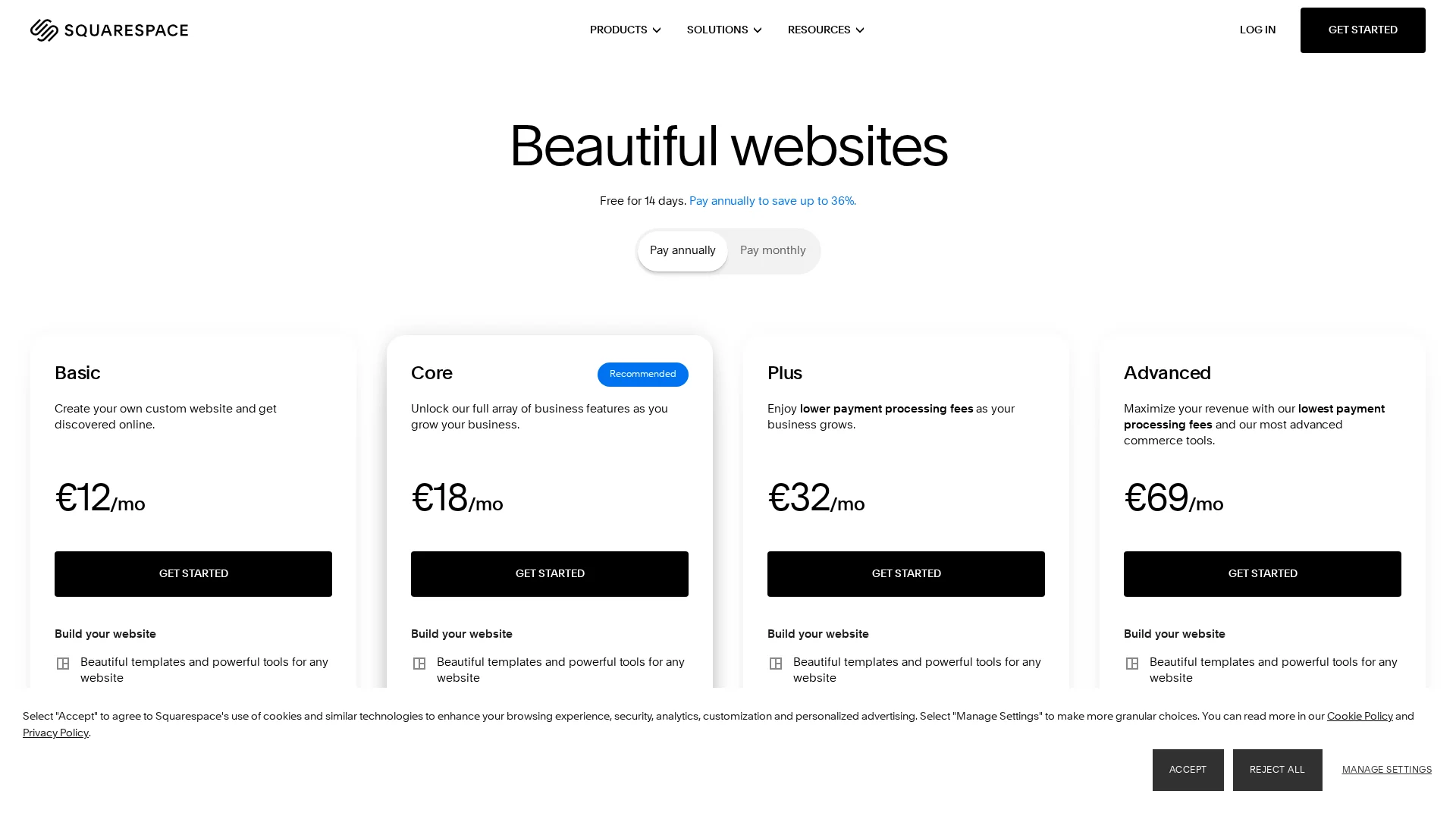
Here’s the honest math. A DIY template site costs $10 to $50 a month but eats 40 to 100 hours of your time, and many small businesses still spend $500 to $5,000 a year on maintenance they didn’t plan for, per this 2025 pricing guide. A custom agency build runs $5,000 to $15,000 upfront and takes months.
Factor
DIY Template
Professional + WaaS
Upfront cost
Low
Bundled monthly
Your time
40-100+ hours
Near zero
Maintenance
Yours
Done for you
With Website-as-a-Service like Monkey Business offers, design, hosting, updates, and support come in one monthly plan, so nobody on your team touches code.
Small business owner reviewing website cost breakdown
A website is never “done.” Plugins need updates, backups need checking, and security holes appear in third-party code. Most small business owners don’t want that job, which is why maintenance plans run $50-$350 a month depending on what’s included.
Templates win on quick edits. Professionals win on scale. Need online booking, ADA compliance, or a new service page next year? A pro site grows with you; a template often forces a rebuild.
Developer updating website maintenance checklist
That’s where Website-as-a-Service fits. Monkey Business bundles design, hosting, updates, and support into one monthly plan, so your site stays current without you touching the backend.
Which Should You Choose: Professional Design or a Template?
Pick a template if your site is simple, your budget is tight, and you have time to maintain it yourself. Pick professional design if your site needs to build trust, meet legal rules, or keep working without you.
Nearly half of small business owners say time is what stops them from keeping a site up, and many sites quietly break within a few years. A 2026 study found one in three local businesses lack a healthy web presence, mostly from neglect.
That’s why done-for-you services exist. Providers like Monkey Business handle design, hosting, and upkeep for one flat fee, so you never touch the back end.
Ready to skip the template trade-offs? Get a professional, done-for-you website with Monkey Business and focus on running your business.
Frequently Asked Questions
Q1: Professional website design vs template sites?
Professional design gives you a custom, secure site built and maintained for you. Templates are cheaper upfront but leave setup, updates, and compliance on your shoulders. Services like Monkey Business offer done-for-you design with hosting and support included.
Q2: How much should a small business website really cost?
A solid DIY template runs $20-50 monthly plus your time. Managed services like Jottful or Monkey Business typically charge flat monthly fees covering design, hosting, and updates.
Q3: Are template sites okay for a professional services firm?
They can work early on. But generic designs rarely build trust with clients comparing you to competitors, and you handle every fix and update yourself.
Make the Choice That Fits Your Business
Templates suit tight budgets and simple sites. Professional design wins on trust, control, and long-term growth. With 83% of small businesses online, match your choice to your goals.
Quick Summary: Professional website design pricing varies widely because scope drives cost, not just looks. The biggest factors are project strategy, page count, custom design, and functionality like ecommerce or booking, with ecommerce alone often adding $3,000 to $10,000 for small sites. To get fair quotes, write a clear brief, ask providers to price the same scope, compare recurring costs like hosting and maintenance, and confirm ownership of files and accounts. For California small businesses and nonprofits, Monkey Business bundles design, hosting, and support into one flat monthly plan, which fits well if you want predictable costs.
Two proposals can look almost identical, yet one team prices research, original content, and integrations that the other skips. That gap makes professional website design pricing hard to compare. This guide ranks the cost factors in modern web design, explains project versus monthly pricing, and flags which providers fit different levels of scope – ranked by how broadly each factor shapes the work, effort, and after-launch care.
Website Design Cost Factors at a Glance
Factor
Best for
What affects cost
Budget question
Project strategy and scope
Organizations needing a dependable project estimate
Discovery, research, planning, deliverables, and change control
What is in scope, and what is explicitly excluded?
Page count and site architecture
Teams comparing small brochure sites with larger websites
Unique templates, page volume, navigation, and migration
How many unique layouts and pages are included?
Custom design and brand requirements
Businesses with distinct brand and experience requirements
Original layouts, brand assets, interactions, and review rounds
Which design elements are bespoke, and how many revisions are included?
Functionality and integrations
Sites that need more than standard informational pages
Feature complexity, integrations, data flows, and testing
Which integrations and third-party fees are included?
What to know about professional website design pricing
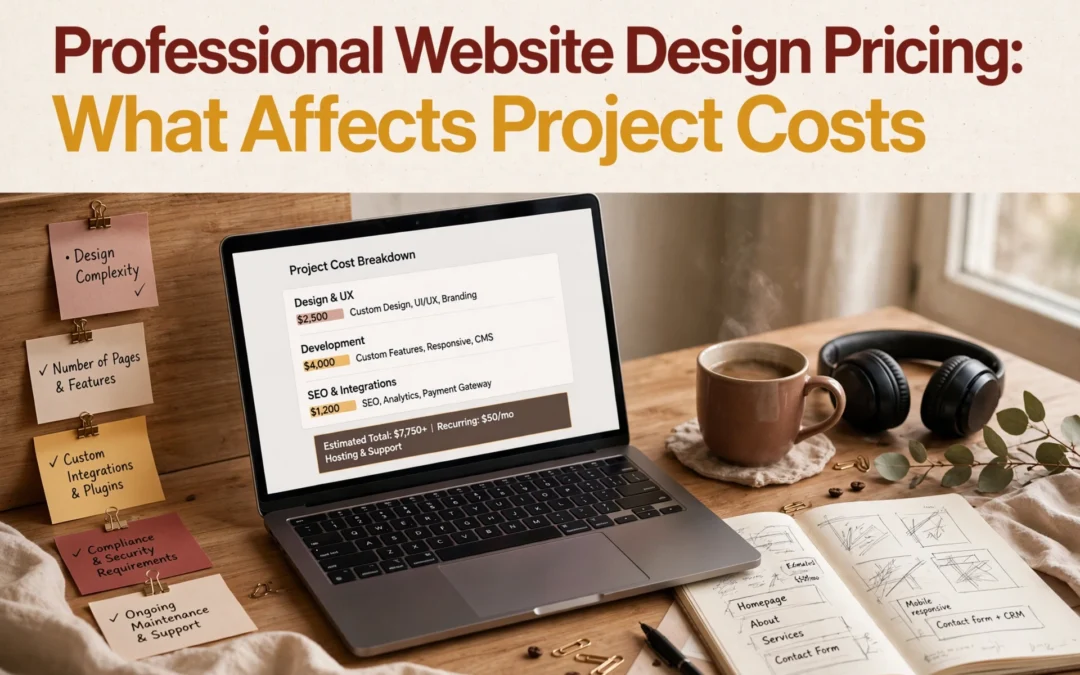
A price quote tells you what you’re paying for only if you know what’s inside it. Professional website design pricing covers far more than the interface you see: discovery, content, development, integrations, testing, and support after launch.
That’s why two modern web design quotes can differ by thousands and still be reasonable. Compare them with the same scope in hand, and split one-time build costs from recurring expenses like hosting, maintenance, and marketing.
Here are the factors that move your number.
1. Project strategy and scope
Every solid estimate starts with a business goal: leads, bookings, donations, sales, or credibility. Before design begins, a good team runs discovery work like audience definition, research, and sitemap planning, which takes time and shapes the price. If the brief changes after approval, new pages or features affect both budget and schedule.
Consultant and owner sketching sitemap on whiteboard
Highlights
Define your main audience and the one action you want visitors to take.
Agree on deliverables, decision-makers, revision rounds, and project assumptions up front.
Separate launch essentials from future enhancements so the quote stays reliable.
A clear written scope prevents disputes, since both sides know what is included and excluded.
Specs
Best for: Organizations needing a dependable project estimate
What affects cost: Discovery, research, planning, deliverables, and change control
Budget question: What is in scope, and what is explicitly excluded?
Keyword lens: Scope drives the real cost behind any professional website design pricing quote, including modern web design builds.
Why it ranks here: Scope sits at the top because every other cost driver depends on what the site must accomplish and what the agency must deliver, from discovery through planning.
A four-page site with a homepage, services, about, and contact is a much lighter build than one with service-area pages, staff profiles, and landing pages. Raw URL count matters less than the number of unique page templates, since each new layout needs its own design, content, and build effort.
Designer arranging website page mockups on desk
Highlights
Count unique page types as well as total URLs.
Include navigation, redirects, and content migration in the estimate.
Plan for reusable layouts where appropriate.
Specs
What affects cost: Unique templates, page volume, navigation, and migration
Budget question: How many unique layouts and pages are included?
Best for: Teams comparing small brochure sites with larger websites
It ranks here because page scope is one of the clearest inputs to compare across proposals.
A distinctive visual system and tailored layouts take more design and review time than a theme. Fully custom work sits at the top of the pricing range, while template builds stay low, and many quotes hide revision limits.
Designer presenting custom layout to client
Highlights
Ask whether the project uses a design system, theme, or fully custom layouts (Clutch pricing guide).
Clarify if brand identity work is part of the website scope (Brand Vision guide).
Confirm revision limits and approval milestones.
Specs
What affects cost: Original layouts, brand assets, interactions, and review rounds
Budget question: Which design elements are bespoke, and how many revisions are included?
It ranks here because visual customization directly drives design hours, and unclear approval steps often add rounds nobody budgeted for.
Interactive features turn a plain website into a working system, and each one adds development, setup, and testing. A contact form is simple; booking, payments, donations, or CRM links cost far more, and ecommerce work alone often runs $3,000 to $10,000 for smaller sites according to WebFX’s cost guide.
Highlights
Document booking, payments, ecommerce, donations, and lead-routing needs.
Identify third-party tools and their separate license fees.
Include integration testing and who owns each account.
Specs
Best for: Sites that need more than standard informational pages
What affects cost: Feature complexity, integrations, data flows, and testing
Budget question: Which integrations and third-party fees are included?
It ranks here because functionality can shift a mostly informational build into an integrated business system with a much larger technical scope.
Four scope drivers get most of the attention, but four more quietly shape what you’ll actually pay. Ask about each one before you sign.
Content, copy, and photography – Confirm whether writing, editing, photo sourcing, and content entry are included or come from your team.
Accessibility, SEO, and technical requirements – Check what accessibility checks, technical SEO setup, privacy tools, and testing the proposal really includes.
Maintenance and post-launch support – Compare hosting, updates, backups, security, and included content edits over time.
Provider and pricing model – Weigh one-time agency projects, freelancers, and managed subscriptions by deliverables, ownership, cancellation, and lifetime cost.
How to choose the right website design budget
Set yourself up for fair quotes before you contact anyone:
Write a short brief first. Name your audience, business goal, required pages, and the actions visitors must take (call, book, donate).
Ask every provider to quote the same scope, itemized across design, development, content, integrations, launch, and support.
Compare full recurring costs, not just the project price: hosting, updates, maintenance, software, and support add up.
Confirm ownership of the domain, files, content, analytics accounts, and subscriptions, plus transfer and cancellation terms.
Match the model to your situation. Custom builds suit teams with in-house help. If you want one flat monthly payment with everything handled, a managed service is usually the better fit.
For California small businesses and nonprofits, Monkey Business bundles design, hosting, maintenance, and support into one done-for-you monthly plan, so there are no surprise invoices later.
Homepage
Now that you know what drives web design costs, skip the surprise invoices. Monkey Business bundles design, hosting, maintenance, and support into one flat monthly plan. Get a clear quote today.
Frequently Asked Questions
Q1: Top agencies for high-end business websites?
Look for agencies that show transparent pricing, real client work, and ongoing support. Monkey Business offers done-for-you design, hosting, and maintenance in one plan, while firms like Jottful and Eversite serve similar needs.
Q2: Why do website prices vary so much?
Scope drives cost. Page count, custom features, copywriting, and compliance needs all add hours. A five-page site costs far less than a booking or e-commerce build.
Q3: What is Website-as-a-Service pricing?
Instead of one large upfront fee, you pay a flat monthly rate covering design, hosting, updates, and support. It spreads costs out and keeps your site maintained.
Q4: Should I budget for maintenance after launch?
Yes. Even a one-time project needs security updates, backups, and edits. Plan for ongoing care, or choose a subscription model that includes it.
Quick Summary: Turnkey website solutions bundle design, copy, hosting, security, and support into one package, cutting launch timelines from months to weeks by running tasks in parallel instead of sequentially. Providers like Monkey Business handle the full build, which prevents handoff delays and scope creep. Before signing, compare what’s actually included, who owns your domain and files, and post-launch support. Run a final checklist covering content, forms, SSL, analytics, and removing staging noindex tags to ensure the site truly works, not just looks done.
A California consultant can lose a referral while a website project waits on separate copy, design, hosting, and development vendors. Each handoff adds weeks, and the launch ready site keeps slipping. This guide shows how a coordinated turnkey build turns that backlog into a launch ready site fast, and what separates a true launch ready site from one that just looks finished. You get a practical checklist, drawn from years of building sites for California businesses.
What Turnkey Website Solutions Include
A turnkey website solution bundles every part of a site build into one package: design, copy, hosting, security, maintenance, and support. You get one team and one invoice instead of juggling a designer, a developer, a hosting company, and a copywriter.
One Team, Fewer Handoffs
When one team handles everything, nothing falls through the cracks between contractors. There is no waiting on a developer to apply a designer’s plan, and no finger-pointing over who owns a bug. Providers like Monkey Business and Jottful run this model as a monthly service.
What a Launch-Ready Site Should Contain
A genuine turnkey package should cover:
Design and build – custom layout, mobile-friendly, on-brand
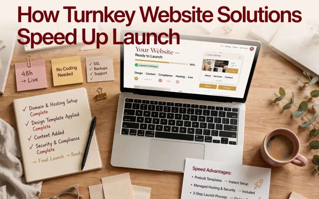
A turnkey website launches faster because one team handles design, writing, hosting, and setup together. You approve the plan instead of coordinating designers, developers, and IT vendors yourself.
Parallel Work Replaces Sequential Delays
In a traditional build, design finishes before coding starts, and content waits its turn. Each handoff adds weeks. A turnkey provider like Monkey Business runs design, copy, and compliance checks at the same time, cutting the typical website launch timeline from months to weeks.
A Defined Scope Prevents Launch Drift
Scope creep is a classic project killer. Research on project failure shows unmanaged changes stretch schedules and budgets. Turnkey contracts fix the deliverables up front: pages, features, and launch date. That agreement keeps momentum and stops endless revision cycles.
Not every “turnkey” offer includes the same things. Before you sign, line up providers on what actually ships after launch.
Compare Scope, Ownership, and Support
Ask for a written list of what’s included: design, hosting, security updates, backups, and post-launch support. Then ask the ownership question – who controls your domain, files, and logins if you leave? Some providers, like Jottful or Eversite, bundle maintenance monthly; others charge per fix. Get the numbers in writing.
Two business owners comparing website service quotes
Check Strategy, Performance, and Local Fit
A launch-ready site starts with goals, not graphics. Experts recommend asking how the provider handles SEO, page speed, and mobile testing before the build begins (see this guide to hiring web developers). For California businesses, it also helps to pick a partner who understands local compliance and your market. Ask to see three live sites launched over a year ago – that’s the real test of quality (more questions worth asking).
Launch Checklist: Confirm the Site Is Ready to Work
Run these checks the day before go-live. A site that looks done and a site that works are not the same thing.
Content and Conversion Checks
Proofread every page twice; placeholder text still ships more often than you’d think.
Test every button, form, and phone link end to end.
Confirm the privacy policy and contact page are live and linked.
Ask one person outside the project to click through the main path to purchase or booking.
Technical and Handoff Checks
Remove any staging noindex tags and make sure robots.txt allows crawling – this is the top launch bug.
Verify HTTPS works on every page and the SSL certificate auto-renews.
Test forms, confirm analytics fire on the live domain, and submit the sitemap to Google Search Console.
Run a speed test and fix anything dragging load time down before users see it.
Keep the old DNS records and a backup for at least 72 hours so you can roll back fast if something breaks.
With a turnkey provider like Monkey Business, most of this list is handled for you and documented in a handoff report – ask for it if your provider doesn’t offer one (see this launch checklist for the full scope).
Homepage
Ready to launch fast without cutting corners? Monkey Business handles design, hosting, and maintenance so you can go live in weeks, not months.
Frequently Asked Questions
Q1: Top agencies for launch-ready websites?
Turnkey providers like Monkey Business, Jottful, AcumenSites, and Eversite deliver launch-ready sites with design, hosting, and support bundled together.
Q2: How fast can a turnkey site go live?
Most turnkey projects launch in two to six weeks, since templates, hosting, and setup are already prepared.
Q3: Do I own my turnkey website?
Ask upfront. Providers like Monkey Business ensure you own your content and domain, avoiding lock-in issues.
Conclusion
A turnkey website compresses weeks of design, SEO, and setup into a launch-ready package. Judge providers on ownership, security, support, and maintenance – small business web adoption shows speed now decides who gets found first.
Quick Summary: For most small businesses and nonprofits, an all-in-one turnkey website beats custom development on cost, speed, and simplicity, with flat monthly fees from $100 to $500 versus $12,000-plus upfront builds. Custom code only makes sense when you need complex business logic like custom portals or unusual integrations. Turnkey providers like Monkey Business handle design, hosting, security, and updates, so you avoid tech headaches and surprise bills. Choose custom only if your site must act like software, not just a polished online presence.
If your California business needs a polished site for services, bookings, or donations, an all in one website usually beats custom development on cost, launch speed, and simplicity. Custom code makes sense only when your site must act like software. We’ve built both for small businesses and nonprofits, so this comparison weighs all in one website options against custom builds across total cost, maintenance, ownership, and growth.
All-in-One Website vs Custom Development: At a Glance
A managed, all in one website service that bundles design, hosting, security, maintenance, and support with one provider. You pay a flat monthly fee and stay focused on running your business. Providers like Monkey Business and Jottful serve small businesses, nonprofits, and professional firms this way.
Turnkey website solution
Key strengths
Predictable monthly cost, no surprise bills
Live in weeks, not months
Provider handles updates, backups, and security
Custom website development
A website or web app built from scratch around your exact workflows and requirements. You get maximum control over design and functionality, but you also own everything that comes after launch. It fits organizations that need custom portals, unusual integrations, or complex logic.
Key strengths
Total design and functionality control
Built for complex growth and custom features
Ideal for apps and portals off-the-shelf tools can’t handle
Cost and Time to Launch
Custom development usually runs $12,000 to $45,000 for a small business site and takes 6 to 12 weeks, though complex projects can stretch much longer according to 2025 US pricing guides. Turnkey services spread that cost across a flat monthly fee. Most plans bundle design, hosting, updates, and support, so typical ranges land between $100 and $500 per month instead of one big invoice.
Factor
Turnkey (WaaS)
Custom Development
Upfront cost
Low to none
$12,000+
Launch time
2-6 weeks
6-12+ weeks
Ongoing fees
One flat monthly rate
Separate hosting, fixes, updates
Budget surprises
Rare
Common (scope creep)
Why the Monthly Model Can Be More Predictable
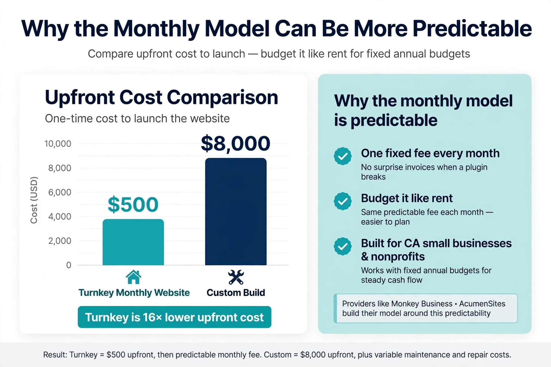
A custom project rarely ends at the quoted price. Revisions, integrations, and post-launch fixes inflate the bill, and maintenance alone often runs $100 to $500 per month on top of the build. Turnkey pricing folds hosting, security updates, backups, and support into one number, so you can budget it like rent. That matters for California small businesses and nonprofits running on fixed annual budgets. Providers like Monkey Business and AcumenSites build their whole model around this predictability: same fee every month, no surprise invoices when a plugin breaks.
Watch the launch date, not just the price. A “cheap” custom build that ships three months late costs you leads the whole time.
Bar chart comparing upfront website costs
Customization, Integrations, and Growth
The Website or the Website’s Business Logic?
Ask what your site actually does, not how it looks. Pages, forms, and a blog fit almost any turnkey plan. But booking systems, quote calculators, CRM syncing, and member portals are business logic – and that is where the two paths split. Custom builds connect to any API or internal system; turnkey plans usually limit you to a fixed connector list. The smarter question: will your needs change in 12 to 24 months? Research on platform limits suggests listing mission-critical integrations first, then choosing. A managed WaaS provider like Monkey Business handles common integrations for you, without hiring a developer.
Small business owner planning booking workflow on whiteboard
With a turnkey plan, the provider owns the technical work. Website-as-a-Service vendors handle hosting, security patches, backups, and updates under one monthly fee. Custom development puts that burden on you or a hired developer – every plugin update and privacy rule lands on your desk. Unpatched plugins remain the top way sites get hacked, which is why managed care matters for busy owners.
The Ownership and Exit Questions to Ask
Before signing, ask:
Do I own my domain and content?
Can I export my site if I leave?
Who fixes a hack – and who pays?
Is CCPA compliance included?
Good providers answer these plainly. Traps hide in vague contracts.
Which Should You Choose: An All-in-One Website or Custom Development?
Pick the all-in-one route if you want a professional site without touching code, hosting, or updates. Pick custom development if you need special features like complex booking systems or custom integrations.
Custom builds offer more control, but they cost more. Projects built by pros often run well into five figures, while builder plans are usually a fixed monthly fee, as Shopify’s comparison explains. Maintenance costs also run higher on custom sites.
For most small businesses and nonprofits, a managed all-in-one plan is the smarter fit. Services like Monkey Business handle design, hosting, security, and updates for one flat monthly price, so you skip the big upfront bill and the tech headaches.
Homepage
Skip the upkeep headaches. Get a done-for-you, compliant website with Monkey Business. Request your free quote today.
Frequently Asked Questions
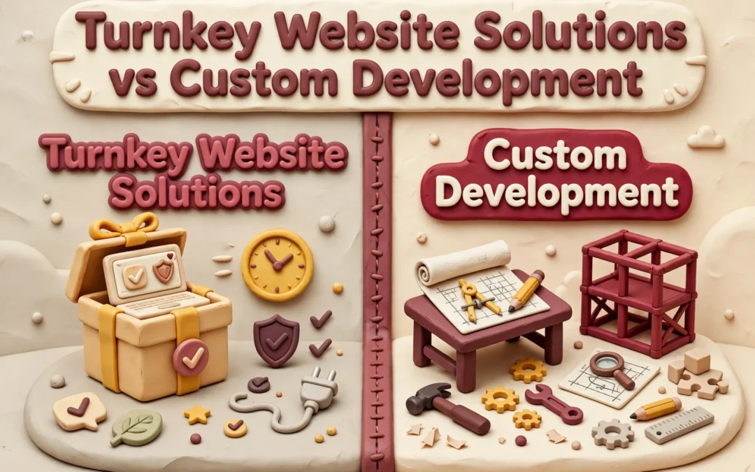
Q1: Turnkey website solutions vs custom development?
Turnkey means one flat fee covers design, hosting, and upkeep. Custom development costs more upfront and leaves maintenance on you. Most small California businesses get better long-term value from turnkey.
Q2: How much does a turnkey website cost monthly?
Most plans run $100 to $300 per month, depending on features and support level. Custom builds often cost $5,000 or more before ongoing hosting and updates.
Q3: Can I migrate my existing site to a turnkey service?
Usually yes. Providers like Monkey Business handle the transfer, keep your links working, and refresh the design during setup.
Q4: Who owns my website content with a turnkey plan?
You own your text, images, and data. Confirm ownership terms in writing before signing any service agreement.
Conclusion
Turnkey wins on time and peace of mind; custom wins on control. Most California small businesses need the former. SBA guidance on digital readiness supports starting simple.