
Quick Summary: The article emphasizes that website accessibility for ADA compliance hinges on key checks like keyboard navigation, visible focus indicators, clear menu labels, and properly labeled form fields. Fixing these issues first ensures users relying on keyboards or screen readers can complete tasks without barriers. Prioritizing these fixes helps prevent lost leads and improves overall usability, especially on critical pages like contact and checkout. Support from specialists like Monkey Business can streamline fixing high-risk accessibility problems.
A form that only works with a mouse or a menu that vanishes for keyboard users can kill leads fast. Many sites look fine but still fail basic tasks like moving through pages, opening menus, and sending forms. This guide ranks the top ADA fixes first. We chose these Website Navigation Checks, Form Accessibility Tests, and Website Compliance Checks based on real audit risk, WCAG fit, and speed to test. These Website Navigation Checks focus on what breaks most.
Quick Comparison
| Check | Best for | What to verify | Common failure | Why it matters |
|---|---|---|---|---|
| Keyboard navigation works across menus and forms | Finding blockers that stop non-mouse users from completing basic tasks | Tab order, menu access, form field focus, and activation keys | Menus or form controls that only work with a mouse | Accessibility fails if the site cannot be operated by keyboard |
| Visible focus is easy to see | Helping keyboard users stay oriented while moving through navigation and forms | Clear focus outline, visible state changes, and no clipping | Focus ring removed or hidden by custom styling | Users must be able to track where they are before they can interact |
| Menu labels are descriptive and consistent | Making the main menu understandable to first-time visitors | Label clarity, consistency, and destination accuracy | Generic menu items that do not explain what users will find | Clear labels reduce confusion and improve task completion |
| Every form field has a visible label | Ensuring users understand what to enter into each field | Visible labels, correct association, and clear required-field cues | Placeholder-only fields or unlabeled controls | A form cannot be accessible if users do not know what each field means |
What to know about ADA website form and navigation checks
Forms and menus decide whether a visitor can book, pay, call, or ask for help. That is why Website Navigation Checks matter so much. If someone uses a keyboard, screen reader, or phone, small design mistakes can stop the task cold.
ADA and WCAG rules focus on the basics that affect real use: clear labels, visible focus, logical tab order, steady movement, and helpful error messages. Strong Website Navigation Checks help you spot those blockers before they cost leads, trust, or access.
1. Keyboard navigation works across menus and forms
Keyboard access is the baseline test for operability. If users cannot tab through menus, fields, checkboxes, and submit buttons, the experience is broken before design even matters.
Highlights
- Test Tab, Shift+Tab, Enter, and Space across menus and forms. WCAG says all functionality should work by keyboard, and focus order must stay logical.
Specs - Best for: Finding blockers that stop non-mouse users from finishing tasks
Last updated: July 20, 2026
Also Read: Latest News on Web Accessibility and Compliance in 2026
2. Visible focus is easy to see
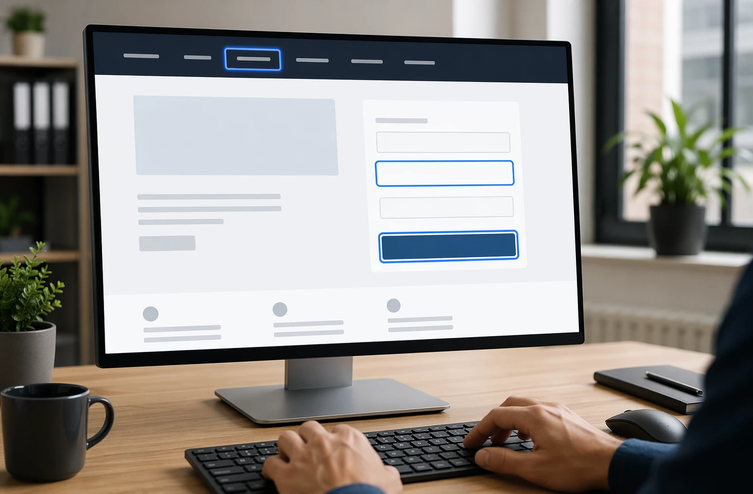
Keyboard users need to see exactly where they are on the page. WCAG says focused items need a visible indicator, and focused elements should not be hidden by sticky headers or overlays per W3C focus guidance and focus not obscured guidance.
Highlights
- Check links, buttons, inputs, and menu items on desktop and mobile.
- Watch for clipped rings, hidden states, and custom widgets with no clear focus.
Pros - Easier menus and forms for everyone.
Cons - Custom styling often removes the default ring.
It ranks here because keyboard navigation fails fast when focus visibility is weak.
Last updated: July 20, 2026
Also Read: Best Accessible Web Design Services for 2026
3. Menu labels are descriptive and consistent
Clear menu labels cut guesswork and dead clicks. Use plain words that match the page users will reach, because W3C says link purpose should be clear and repeated functions should stay consistently identified across pages.

Highlights
- Use specific labels like Book Appointment or Request a Quote
- Keep the same wording in the header, footer, and mobile menu
- Give icon-only controls clear text or accessible names
It ranks here because navigation only works when people can predict the destination.
Last updated: July 20, 2026
Also Read: ADA Compliant Website Design: What Your Business Needs to Know
4. Every form field has a visible label
Form labels are non-negotiable for accessible lead capture. Placeholder text alone is not enough because it disappears and does not reliably label a field for users, as W3C explains.
Highlights
- Check every input has a visible label tied to the right field, following W3C label guidance.
- Use clear labels for required fields without color only.
- Label each radio button and checkbox option separately.
Pros
- Improves completion and usability fast.
Cons
- Older templates may need markup fixes.
It ranks here because missing labels can stop form completion completely.
Last updated: July 20, 2026
Other checks worth keeping on your audit list
Want a fuller audit? Add these checks after the core fixes. They catch issues that often block form completion and confuse navigation.
- 5. Instructions appear before input.
- 6. Related fields stay grouped.
- 7. Errors name the issue and fix.
- 8. Link text says the destination.
- 9. Accessible names match labels.
- 10. Focus or input never triggers surprise changes.
How to choose the right ADA checks to fix first
Pick fixes by business risk, not by what seems easiest. Start here:
- Fix keyboard access and visible focus first. If users cannot move through menus or forms, the rest does not matter.
- Audit lead pages first: home, contact, service, booking, donation, and checkout pages.
- Prioritize conversion points. Broken form fields, menus, and buttons cost real leads and sales.
- Test desktop and mobile separately. Responsive menus often break in different ways.
- Save error-message tuning for round two. Labels, focus, and keyboard access come first.
- If you use custom UI, test that early. This is where Monkey Business stands out, since its done-for-you support helps small teams catch high-risk issues faster.

Need help fixing ADA issues in forms and navigation? Monkey Business builds, hosts, and maintains compliant websites, so you can stop guessing and move faster.
Frequently Asked Questions
Q1: What are the key legal requirements for ADA website compliance in the US for small businesses?
Public-facing sites should offer equal access. Follow ADA expectations by meeting WCAG 2.1 AA standards, especially for forms, menus, keyboard use, labels, contrast, and error help.
Q2: How can I check my website’s ADA and WCAG 2.1 AA compliance effectively?
Test with keyboard-only use, screen readers, zoom, and color contrast checks. Review every form, menu, popup, and error state. Automated scans help, but manual testing finds the biggest real-world barriers.
Q3: What are the top 10 ADA website design checks for forms and navigation accessibility?
Focus on keyboard access, visible focus states, clear labels, grouped fields, error messages, skip links, logical tab order, menu usability, link purpose, and consistent navigation across pages.