A supporter hears about your food pantry, opens your site on a phone, and cannot tell what a gift funds. She tries to finish the donation form, but it will not work with her keyboard. That lost gift comes from design, not from doubt. An accessible nonprofit site fixes this. This guide shows you how to build an accessible nonprofit site step by step, so your website supports giving.
Step 1: Map the Mission and Supporter Journey
Make the First Visit Clear
Before you pick colors or software, write down what your site must do. Most donors land on your homepage for one of three reasons: to give, to learn what you do, or to volunteer. Your job is to guide each one in under ten seconds.
Put your mission in one plain sentence near the top of the page. Then place a Donate button where eyes go first, usually the top right corner. Follow the visitor’s path from homepage to donation form and remove every step that does not help. That means fewer form fields, clear costs, and mobile-friendly pages. An accessible nonprofit site also means readable fonts, strong color contrast, and text that works with screen readers, so no supporter is blocked from giving.
An accessible web design partner can handle those details for you, but your team should still own the map: who visits, what they need, and what action you want from them.
Quick checklist:
Priority
Action
Why It Matters
Mission
One clear sentence above the fold
Visitors understand you fast
Donate
Button visible on every page
Cuts friction at the key moment
Accessible nonprofit site
Contrast, alt text, keyboard navigation
Every supporter can give
Step 2: Choose a Website Setup Your Team Can Maintain
Compare Features With Real Workflows
The best platform is the one your volunteers can actually run. Before you compare prices, map out who will post updates, how often, and what happens when someone goes on vacation.
Then test each option against that routine:
Update ease: Can a non-designer swap a photo or event date in under ten minutes?
Donations built in: Does it handle recurring gifts, receipts, and mobile giving without extra plugins?
Support when stuck: Is help available by phone or chat, not just forums?
Maintenance included: Who applies security updates and backups?
Many small nonprofits skip this step and outsource everything to a service instead. A managed plan like website maintenance from Monkey Business covers hosting, updates, and fixes for one monthly fee, which suits teams with no technical staff.
Setup Type
Upfront Cost
Ongoing Work
DIY platform
Low
You handle all updates
Managed service
Low monthly fee
Provider handles maintenance
Custom developer
High
Depends on contract
Generated illustration
Whichever route you pick, ask for a trial run. Post one real update yourself before you commit.
Step 3: Build an Accessible, Trustworthy Giving Path
Remove Common Barriers From the Donation Flow
Your donation page should let someone give in under two minutes. Every extra field, forced account, or confusing button costs you gifts, so cut the form to the basics: amount, payment, contact, and an optional note. Offer preset amounts with clear labels, plus a monthly option, and make the “Donate” button easy to spot on every page.
Accessibility matters just as much. Use large, readable text, strong color contrast, and keyboard-friendly navigation. Add alt text to images and label form fields clearly, because screen readers depend on them. If you want a fuller walkthrough, our guide to non-profit website accessibility covers the details.
Trust closes the gift. Show your secure checkout badge, explain where the money goes, and confirm each donation with a clear thank-you page and receipt email.
Test the full flow yourself, on a phone, before launch. Give five dollars, then try to cancel the monthly plan. If that frustrates you, it frustrates donors.
Generated illustration
Step 4: Test, Launch, and Keep the Site Useful
Before launch, test on a phone, a tablet, and a laptop. Give a small donation yourself and fix anything confusing. Check the site with a screen reader if you can.
After launch, the work shifts to upkeep: software updates, backups, and security checks. Assign one person to own these tasks, or hand them off. Many small nonprofits use ongoing website maintenance services so staff can stay focused on the mission.
Tip: Review your site every quarter. Update stale photos, test the donate form, and thank recurring donors.
Homepage
Need a giving-ready site but lack the time or web skills? Monkey Business handles design, hosting, and care for you, so your team can focus on the mission.
Frequently Asked Questions
Q1: Top nonprofit website packages for small teams?
Look for bundles that include design, hosting, maintenance, and donation tools in one monthly plan. Managed services like Monkey Business suit small teams best.
Q2: How much should a nonprofit website cost?
Expect $30-$150 monthly for managed plans, or $3,000+ upfront for custom builds.
Q3: Do we need ADA compliance?
Yes. Accessible design protects your nonprofit legally and helps every visitor give.
Build a Website That Makes Giving Easier
A strong nonprofit site shares your mission clearly, makes donating simple, and stays secure and accessible. Build it step by step, and plan for ongoing maintenance so every visit turns into support.
Quick Summary: Small charities should treat accessibility as mission-critical because a blocked donation form costs real gifts, not just a sale. The article says to test the highest-stakes paths first, like donating, volunteering, and contact pages, using keyboard-only navigation and screen reader checks. Free fixes such as alt text and color contrast come before any rebuild. For most small charities, a done-for-you monthly plan from Monkey Business beats a one-off build since it covers accessible design, hosting, and maintenance without burdening volunteers.
A blocked donation form stops a supporter cold. A business site may lose a sale, but a charity loses mission impact. Mission driven design treats every visitor, from donors to people seeking services, as essential. We compare both site types through mission driven design principles, then give you a short plan to fix what matters first. That is mission driven design in practice.
Nonprofit vs. Business Websites: Accessibility at a Glance
Nonprofit website
General business website
Primary user journeys
Donating, volunteering, finding services, learning about impact
Researching, contacting, booking, or purchasing
Accessibility priorities
Usable navigation, content, forms, and assistive-technology support
Usable navigation, content, forms, and assistive-technology support
Calls to action
Donation, volunteer, service-access, and advocacy paths
Product inquiry, booking, purchase, or contact
Content and media
Mission stories, program details, impact information, campaign media
Product or service details, proof points, and customer information
Ongoing review
Recheck pages and forms as campaigns and content change
Recheck pages and transactional flows as content changes
How Nonprofit website and General business website Compare
Nonprofit website
A nonprofit website exists to serve a mission, not a sale. Its key journeys are donating, volunteering, finding services, and learning about impact, so accessibility work focuses on clear navigation, simple forms, and support for assistive technology like screen readers. Because campaigns and content change often, pages and forms need regular rechecks.
Key strengths
Mission stories and impact content build trust with supporters
Multiple action paths: give, volunteer, get help, advocate
General business website
A general business website is built around product or service discovery and customer conversion. Visitors research, contact, book, or buy, so accessibility priorities cover usable navigation, readable content, and smooth transactional flows. Any time offers or checkout steps change, those paths deserve a fresh check.
Key strengths
Conversion-focused structure makes next steps obvious
Product details and proof points answer buyer questions quickly
Where Accessibility Needs Overlap, and Where Charity Sites Differ
Most needs overlap: every site needs clear text, keyboard navigation, alt tags, and readable color contrast. A business site and a charity site both fail visitors the same way.
Charities differ in how people use them. Donors come to give, volunteers come to sign up, and families in crisis come to find help fast. That means your donation form, event sign-up, and contact page carry the heaviest accessibility load. Test those first.
Volunteer assisting senior donor with online donation form
Make the Charity’s Most Important Tasks Accessible
For a small charity, the key jobs are usually donating, signing up to volunteer, and finding your contact details or service hours. Walk each of those paths yourself before launch, then ask someone else to try it. If a task takes more than a few clicks, fix it.
Test Forms and Navigation from Start to Finish
Follow every step of a donation and a volunteer sign-up with your keyboard only. Can you reach each field with Tab? Do labels read clearly to a screen reader? Does the submit button work without a mouse? One broken step costs real gifts, so test with our accessibility checklist in hand.
Hands typing on keyboard testing donation form
Prioritize Fixes a Small Charity Can Maintain
Start with what your team can actually keep up. A missing alt text habit or bad color contrast matters more than a perfect audit you never revisit. Fix the basics first: add alt text to images, check color contrast, label your forms, and make sure every page works with a keyboard alone. These are one-time edits that last.
Skip heavy rebuilds until the simple wins are done. If ongoing upkeep feels out of reach, a managed option like accessible web design services keeps standards in place without extra staff.
Which Website Approach Should a Small Charity Choose?
For most small charities, a done-for-you monthly plan beats a one-off build. You get accessible design, hosting, maintenance, and support handled for one predictable fee. Freelancers cost less up front but leave updates and compliance on your plate, and DIY builders shift the accessibility burden to your volunteers. Weigh your team’s time honestly. If nobody can maintain the site, a service like non-profit website design is the safer, cheaper choice over three years.
Homepage
Want an accessible site without hiring a developer? Monkey Business builds and maintains compliant nonprofit websites for you, so visit today.
Frequently Asked Questions
Q1: Non-profit websites vs general business websites?
A non-profit site must guide donors, volunteers, and people seeking help, so accessibility supports each journey differently. Clear donate buttons, readable forms, and screen-reader-friendly text matter more than sales features.
Q2: What is the cheapest accessibility fix for a small charity?
Add alt text to images and check color contrast. Both are free, fast, and help the most visitors, including those using screen readers.
Q3: Do accessibility rules apply to small charities?
Yes. If your site serves the public, courts and the ADA generally expect reasonable access, regardless of budget or staff size.
Q4: Can a done-for-you service handle compliance?
It can. Providers like Monkey Business include accessible design, hosting, and maintenance, so volunteers never touch code.
Make Accessibility Part of the Mission
Accessible design helps more donors, volunteers, and the people you serve. Simple checks fix most barriers, so treat accessibility as part of your mission.
Quick Summary: A nonprofit website redesign fails if it only changes looks, so this 12-point checklist prioritizes fixing donation pages, keyboard and screen-reader access, and clear audience paths. Start by setting measurable goals and baseline analytics, then test the full giving journey on mobile and with assistive tech before launch. Protect URLs and integrations, assign owners, and review engagement after launch. For small teams, a done-for-you service like Monkey Business bundles design, hosting, and support into one plan.
A supporter may arrive ready to give. Then an unlabeled field, a hidden Donate button, or a form that ignores keyboard users stops the gift cold. Donation pages fail quietly like that. A redesign that only swaps colors and layouts can keep every barrier in place. This 12-point checklist helps you decide what to fix, what to protect, and what to measure, with special care for donation pages and inclusive engagement. Treat it as a planning and quality-assurance framework, then test the live site with real people and assistive technology.
Nonprofit Redesign Checklist at a Glance
Checklist item
Best for
Primary focus
Key test
Set redesign goals and baseline measures
Teams beginning redesign planning
Goals and measurement
Each priority action has a defined outcome
Make donation pages accessible and easy to complete
Organizations accepting online gifts
Accessible giving journey
Complete a test donation from start to confirmation
Test keyboard, screen-reader, and contrast access
Teams reviewing inclusive access
Keyboard and assistive technology access
Complete key tasks without a mouse
Clarify mission, audience paths, and calls to action
Organizations serving multiple audiences
Mission clarity and visitor actions
A first-time visitor can identify a relevant next step
What to know about nonprofit website redesigns
Your website serves many people at once: donors, volunteers, and those seeking your services. A redesign only works if each journey stays clear, accessible, and easy to complete.
It also matters for fundraising. If a donor can’t give on their phone, or a screen reader can’t parse your donation page, you lose support you already earned.
This checklist walks through the steps that protect your content, your search traffic, and your donors’ experience.
1. Set redesign goals and baseline measures
Decide what the new site must help people do before picking layouts or features. Name priority actions like donating, signing up as a volunteer, or finding a program. Then record current numbers, since baseline analytics show which pages need work and let you measure improvement later.
Nonprofit team planning website goals with sticky notes
Highlights
Identify your main audiences and their most important tasks.
Set measurable goals for donation pages, sign-ups, and service information.
Record current traffic and completion numbers where you can.
Pros
Creates shared direction for staff and project partners.
Makes post-launch evaluation more meaningful.
Cons
Requires agreement on priorities and access to baseline data.
This step ranks first because clear goals keep a redesign from becoming a looks-only project and give every later decision a basis.
Last updated: October 2, 2026
2. Make donation pages accessible and easy to complete
Treat your donation form as a core website journey, not an isolated payment widget. Walk the full path from the Donate button through payment and confirmation, checking labels, instructions, and error messages along the way.
Person donating online via laptop form
Highlights
Make the Donate route easy to locate and understand.
Use clear labels and error messages that don’t rely on color alone.
Test the whole form with keyboard navigation, and test on mobile too.
Pros
Addresses a high-priority action for donors.
Surfaces usability and accessibility problems in the same review.
Cons
Third-party donation tools may need separate testing.
It ranks here because donation pages drive both fundraising and fair access. A polished page fails if some supporters can’t complete it.
Last updated: October 2, 2026
3. Test keyboard, screen-reader, and contrast access
Check your key pages and interactions manually as well as with automated tools. Cover the homepage, navigation, donation pages, and contact forms. Confirm keyboard focus order, visible focus indicators, clear headings and labels, strong text contrast, and useful alt text for meaningful images. Automated scans help, but they are one input, not a full answer – pair them with human review.
Person tabbing through website form with contrast checker
Highlights
Navigate key tasks, like giving, without a mouse
Check focus order, form labels, headings, and contrast
Include human review and a simple way for visitors to report barriers
Finds barriers that repeat across shared templates and affect many users
Gives you concrete issues to fix and retest
Cons
Automated scans alone cannot prove every user journey works
Internal pages fit: accessible web design can be tested during redesign. It ranks here because shared templates can block key actions site-wide, so test early.
Last updated: October 2, 2026
4. Clarify mission, audience paths, and calls to action
Make it clear who you serve and what each visitor can do next. Walk through your homepage as a donor, volunteer, and program participant would. Then give each one a clear path, like Donate, Volunteer, or Find Services.
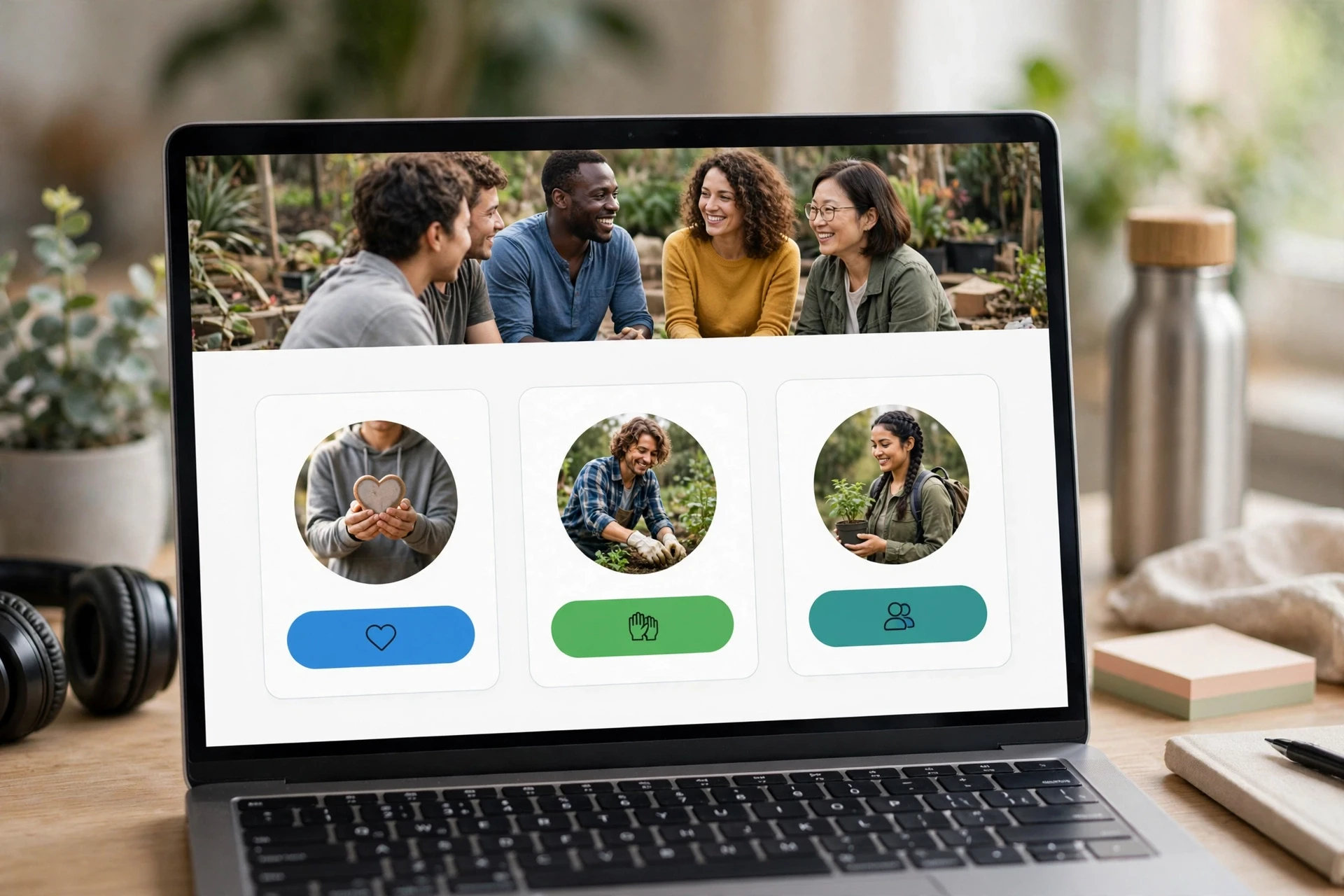
Homepage mockup with prominent donation buttons and diverse community photos
Highlights
Give the homepage a clear, audience-centered purpose.
Use descriptive buttons instead of vague link text, such as specific calls to action tailored to each page.
Helps visitors understand the organization and available actions.
Cons
Requires stakeholder input to prioritize audiences and avoid competing calls to action.
It ranks here because visitors cannot give or engage if they cannot tell what your organization does or where to go.
Last updated: October 2, 2026
More Checks to Complete Before and After Launch
Your donor and accessibility work covers the big stuff. These remaining checks keep the redesign solid long after launch day, especially for small teams managing the site themselves.
Simplify navigation and page structure – Group pages around visitor needs, use clear labels, and keep main routes consistent.
Use plain language and authentic impact content – Explain programs and results simply, and get permission for stories and photos.
Build mobile-first, readable page layouts – Check legibility, tap targets, and speed on phones.
Strengthen trust and donation-form consistency – Keep branding coherent and make giving and privacy info easy to verify.
Protect URLs, search visibility, and integrations – Map redirects and test fundraising and email connections.
Test forms, links, and confirmation messages – Run full checks on donations, sign-ups, and receipts.
Prepare staff and content owners – Document publishing routines and assign responsibility.
Review engagement and accessibility after launch – Schedule regular reviews of feedback, analytics, and key journeys.
How to prioritize your nonprofit redesign
Fix the tasks your visitors care about most first: giving, volunteering, and finding services. Then work through these checks:
Test the donation journey early. Payment forms and third-party tools often carry their own accessibility and usability problems.
Improve shared parts. Better navigation, headings, and form patterns lift every page at once.
List what must survive. Note key pages, URLs, and integrations before you pick a new structure or platform.
Assign owners. Someone needs clear responsibility for content, accessibility checks, analytics, and post-launch fixes.
Small teams rarely have staff for all of this. A done-for-you service like Monkey Business bundles design, hosting, maintenance, and support into one plan, so a lean nonprofit gets agency-quality work without hiring.
Homepage
Ready to make your nonprofit site accessible and engaging? Monkey Business handles the whole redesign for you. Start today.
Frequently Asked Questions
Q1: Best nonprofit websites for fundraising groups?
Pick a platform with fast donation pages, clear buttons, and strong accessibility. Monkey Business builds done-for-you nonprofit sites with hosting, updates, and support included.
Q2: How much should a nonprofit website redesign cost?
Small nonprofits often spend $3,000 to $10,000, though subscription plans spread costs into affordable monthly payments.
Q3: How often should we update our website?
Review content monthly and plan a full redesign every three to five years.