Small Business Websites vs DIY Builders for Lead Generation

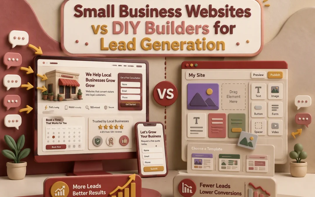
Small Business Websites vs DIY Builders for Lead Generation

Quick Summary: Custom websites built by professionals generally generate higher quality leads because they focus on trust, clear messaging, and strong calls to action. DIY website builders are faster and cheaper initially but often result in weaker lead conversion and higher owner time costs. For businesses where leads are crucial, investing in professional design pays off through better credibility and long-term ROI.

If your business lives on calls, forms, or bookings, DIY Website Builders rarely beat custom design for lead quality. Service firms, nonprofits, and local brands need sites that build trust and convert. This comparison uses real Lead Generation Strategies and practical Website Design Tips to show where DIY Website Builders work, where DIY Website Builders fall short, and which choice fits your budget and growth plan.

DIY Website Builders vs Professional Web Design for Lead Generation: At a Glance

DIY website builders Professional web design
Lead generation strength Good for basic lead capture; depends on user setup Strong; built to convert qualified inquiries
Launch speed Fast, often same day Slower than DIY; guided build process
Ongoing time commitment High; owner manages updates and optimization Low; service team handles execution
Customization and strategy Moderate; limited by templates and self-execution High; tailored to business goals and audience
Cost structure Low monthly cost, plus owner labor Higher upfront or monthly investment
Best for Simple sites, tight budgets, and quick launches Service businesses, nonprofits, and growth-focused local brands

How DIY website builders and Professional web design Compare

DIY website builders

DIY website builders are no-code platforms for owners who want to launch fast and manage the site themselves. They fit simple websites, tight budgets, and basic lead capture, but results depend heavily on how well you set up pages, forms, and follow-up.
DIY website builders
Key strengths

  • Fast launch
  • Lower monthly cost
  • Easy self-service editing

Professional web design

Professional web design is a done-for-you option built around strategy, trust, and conversion-ready lead generation. It fits service businesses, nonprofits, and local brands that want stronger lead quality without owning the daily website workload.
Professional web design
Key strengths

  • Higher customization
  • Lower owner time
  • Stronger conversion focus

Which Option Produces Better Leads?

Custom sites usually win because they build trust, reduce friction, and guide one action. Stanford found people judge credibility fast, and design look was the most cited factor in one large study of website trust Stanford credibility research.

A site converts better when it has:

  • a clear offer
  • proof you are real
  • one strong call to action

Easy contact info, useful pages, and a professional look all raise trust, according to Stanford’s web credibility guidelines.

DIY sites often miss that strategy. Owners focus on colors, pages, and launch speed, but skip message flow, proof, and inquiry paths. That is why many DIY sites get traffic but weak leads.

Also Read: 10 Must-Have Professional Website Design Elements for U.S. Small Businesses

Cost, Timeline, and Owner Time: The Real ROI Difference

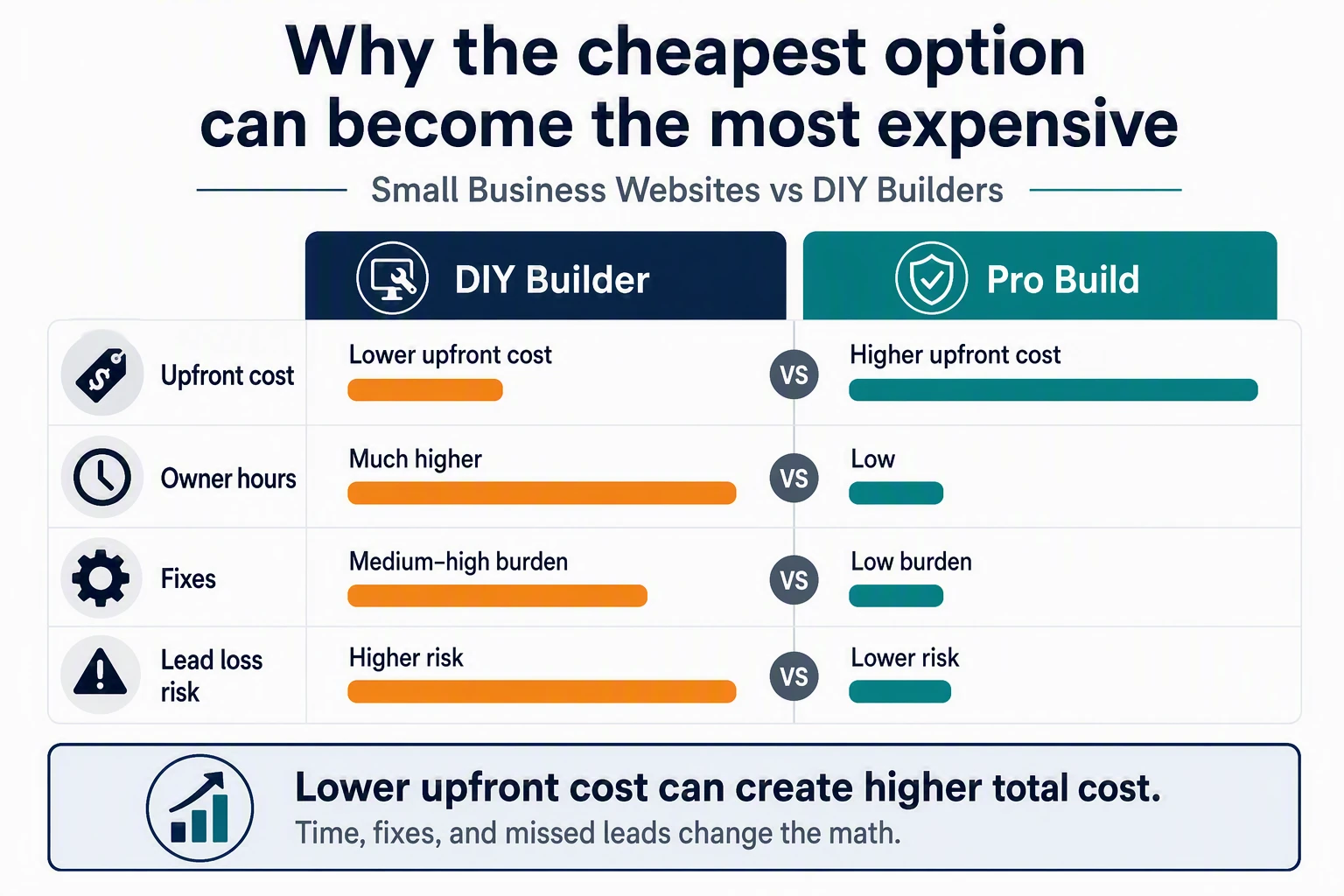
Why the cheapest option can become the most expensive

DIY looks cheap until you count your hours. Forbes notes small business website costs vary widely in 2026, but the real gap is owner time, fixes, and lost leads from weak pages Forbes cost guide. If you spend nights writing copy, testing forms, and chasing bugs, the “savings” disappear fast.

Bar chart comparing DIY and professional website costs with owner hours

Cheap upfront often means higher hidden cost later.

When professional design pays for itself

A pro-built site pays back when it launches faster and converts better. You trade weeks of trial and error for a tighter process, clearer calls to action, and less owner stress. That matters even more if your business depends on trust and honest reviews under the FTC’s reviews and testimonials rule.

Also Read: 7 Small Business Website Features That Boost Conversions

Why Trust, Compliance, and Follow-Up Matter More Than Templates

Trust signals lift form completions faster than prettier layouts. Add a real phone number, service area, reviews, staff photos, and a clear privacy link. The FTC says businesses should clearly explain how they use personal data in their consumer privacy guidance.

Business owner answering calls beside laptop with reviews and contact form

Lead capture should go past one contact form. Use quote requests, scheduler links, callback buttons, and CRM alerts so no inquiry sits cold. Good follow-up also needs clean consent and recordkeeping, especially for calls and texts, as noted in this lead consent guidance.

Also Read: Blog | Monkey Business

Which Should You Choose for Lead Generation?

Choose DIY if speed and simplicity come first

Pick DIY when you need a basic site live fast, your offer is simple, and one contact form is enough. It works best for early testing, side businesses, or groups with tight budgets. Keep expectations modest.

Choose professional design if leads drive revenue

Pick professional design when each lead has real value. Stanford research found people judge credibility fast, and design look strongly shapes trust in this large web credibility study. Their guidelines also stress clear contact details, expertise, and a professional look for stronger web credibility. For service firms, that usually means more qualified leads.

Homepage
Homepage

Need more leads without managing a DIY site? Monkey Business builds, hosts, and supports conversion-focused websites for you.

Frequently Asked Questions

Q1: What are the key differences between DIY website builders and professional web design for small businesses?

DIY builders favor speed and lower upfront cost. Professional design gives you stronger messaging, better trust signals, cleaner SEO setup, and a site built around lead flow instead of templates.

Q2: How does professional website design improve lead generation and conversions for small businesses?

A pro site guides visitors to act. It improves page speed, mobile layout, calls to action, forms, service pages, and proof elements that turn more clicks into qualified leads.

Q3: What are the cost, timeline, and ROI comparisons for DIY vs professional small business websites?

DIY is cheaper and faster to launch, but often costs more in lost leads and fixes. Professional sites take longer and cost more upfront, yet usually deliver better long-term ROI.

Conclusion

DIY builders can work for simple sites. But lead generation usually improves with a custom, trust-first website, since design look shapes credibility judgments. The better choice is the one built to earn trust and drive qualified inquiries.

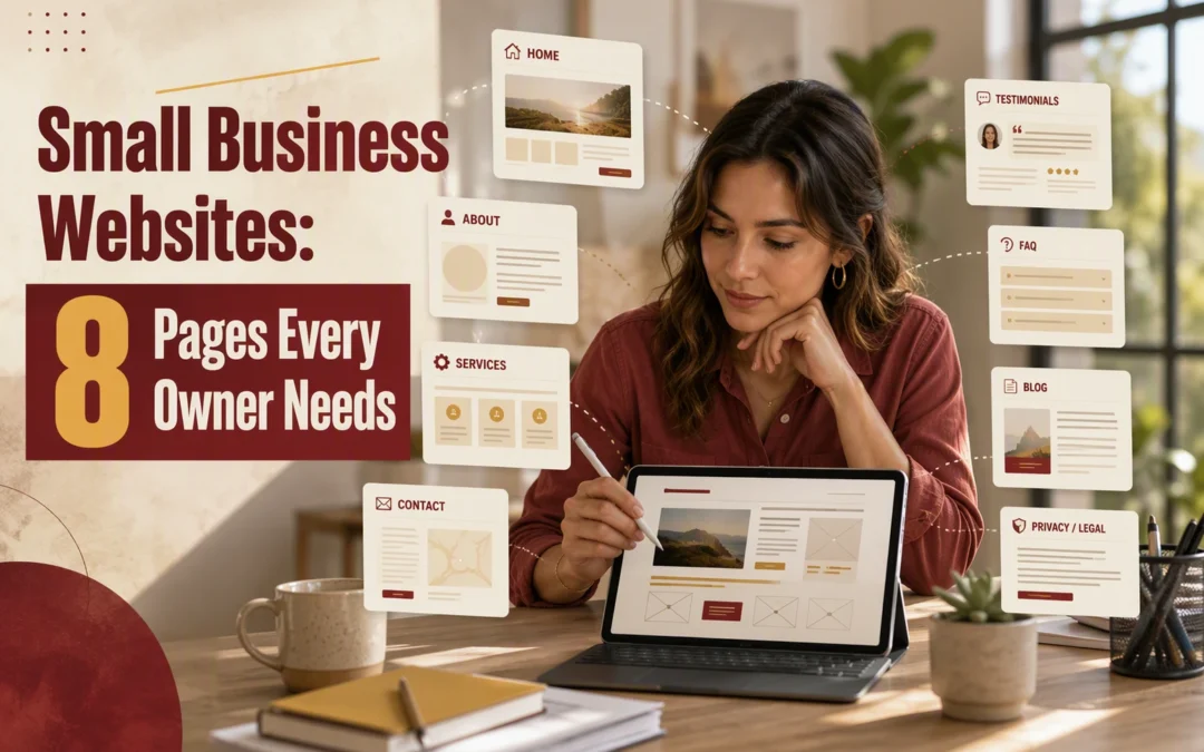
Small Business Websites: 8 Pages Every Owner Needs

Small Business Websites: 8 Pages Every Owner Needs

Quick Summary: A small business website should focus on eight key pages: homepage, about, services or products, contact, testimonials, FAQ, location, and legal pages. Each page must answer specific questions, build trust, and guide visitors toward contact or sales. Starting with these core pages helps convert visitors and grow trust efficiently.

If your site has only a few pages, structure is what separates polished Small Business Webs from ones that bring in leads. Many owners launch with a homepage and contact page, then skip the pages that answer questions and build trust. This guide to Small Business Websites shows the 8 pages that matter most. We chose them from proven Business Website Design patterns. If needed, build your first four Small Business Webs now, then grow.

Quick Comparison

Page Best for Must-have content Primary conversion role Priority
Home Page First impressions and guiding visitors Clear offer, summary of services, contact links Directing visitors to the next step Highest
About Page Trust and credibility Story, values, team or founder intro Reducing hesitation Very high
Services or Products Page Explaining offers and driving sales Offer details, deliverables, CTA Turning interest into action Very high
Contact Page Lead capture and support Form, phone, email, hours Turning visitors into inquiries High

What to know about small business websites

A good website does not need dozens of pages. It needs the right ones. Small Business Webs work best when each page answers a clear question, builds trust, and moves people one step closer to contact.

That matters more now because buyers compare fast. If your Small Business Webs feel thin, missing, or hard to follow, people leave. A complete site helps them understand your offer, trust your business, and reach out with less doubt.

1. Home Page

Your homepage is your site’s main summary page. It should tell visitors what you do, who you help, and what to click next within seconds, as NNGroup explains.

Small business owner reviewing homepage layout with designer in bright office

Highlights

  • State your offer in the first screen.
  • Add a short services summary.
  • Use trust signals like reviews or partner logos.
  • Give clear paths to contact, book, or learn more, as the U.S. Chamber notes.

Specs

  • Best for: First impressions and guiding visitors
  • Must-have content: Clear offer, summary of services, contact links
  • Primary conversion role: Directing visitors to the next step

Pros

  • Central hub
  • Builds trust fast

Cons

  • Easy to overcrowd
  • Weak copy confuses visitors fast

It ranks first because most visitors judge your business here.

Last updated: August 8, 2026

Also Read: 5 Essential Tips for Selecting a Reliable Website Security Provider

2. About Page

Your About page makes your business feel real. It gives people a reason to trust you before they call, especially in service businesses where buyers often research the team first, as noted by NN/g and Google.

Founder consulting with client in cozy studio workspace

Highlights

  • Tell a short story
  • Show values and your founder or team
  • Focus on how you help the customer

Specs

  • Best for: Trust and credibility
  • Primary conversion role: Reducing hesitation

Pros

  • Humanizes your brand
  • Supports local trust

Cons

  • Can get too self-focused

Buyers often check this page before contacting you, so it earns a very high spot.

Last updated: August 8, 2026

Also Read: 7 Small Business Website Features That Boost Conversions

3. Services or Products Page

This is where interest turns into buying intent. Show what you sell, what’s included, and the next step. Clear pricing or starting rates help, and the FTC says businesses should avoid vague fee labels and be upfront about charges in its fee guidance.

Shop owner arranging product packages at checkout counter

Highlights

  • Describe each offer clearly.
  • List deliverables, outcomes, or key features.
  • Add pricing or starting points when it fits, and make buying terms easy to review using FTC online shopping advice.
  • End with one strong CTA.

Pros

  • Tied closest to sales.
  • Cuts repeat questions.

Cons

  • Gets weak fast if it reads like a brochure.

This ranks high because it moves ready buyers toward booking, quoting, or buying.

Last updated: August 8, 2026

Also Read: Blog | Monkey Business

4. Contact Page

Your contact page should help people reach you fast. Keep it simple: a short form, phone, email, hours, and clear next steps. Google also tells businesses to keep hours accurate on their profile and website business hours guidance.

Reception desk with staff answering calls in a bright office

Highlights

  • Short form
  • Phone, email, hours
  • Response time
  • Location or booking details

Specs

  • Best for: Lead capture and support
  • Must-have content: Form, phone, email, hours

It ranks high because this page turns ready visitors into inquiries right when intent peaks.

Last updated: August 8, 2026

Also Read: ADA Compliant Website Design: What Your Business Needs to Know

Honourable Mentions

These pages may not make the core cut first, but they still help conversions and trust.

  1. FAQ / Support Page – Answers objections before they block a sale.
  2. Portfolio or Case Studies Page – Shows your work gets real results.
  3. Blog Page – Helps grow visibility over time.
  4. Testimonials Page – Adds social proof that supports the buying decision.

How to choose the right pages for your small business

Pick pages based on what brings results first.

  • Match your main goal: leads, bookings, donations, or sales should decide your first pages.
  • Start lean: publish Home, About, Services or Products, and Contact first if time is tight.
  • Add FAQ early if people keep asking the same pre-buy questions.
  • Show proof: use Portfolio or Case Studies when trust depends on past work.
  • Add a blog only if you can stay consistent with useful, keyword-focused posts.
  • Spread testimonials across key pages instead of hiding them on one page.

If you want help choosing and building the right mix fast, Monkey Business is the strongest fit for done-for-you setup and ongoing support.

Homepage
Homepage

Need these pages built right the first time? Monkey Business handles design, hosting, updates, and support so your site stays clear, compliant, and ready to convert.

Frequently Asked Questions

Q1: What are the essential pages every small business website should have?

Most small business sites need a homepage, about page, services page, contact page, testimonials page, FAQ page, location page, and privacy or legal page. If you sell online, add product and checkout pages too.

Q2: How can a small business optimize its homepage to attract visitors?

Lead with a clear headline, say who you help, and add one strong call to action. Show trust fast with reviews, service areas, and key benefits. Keep menus simple so people know where to click next.

Q3: What content should be included on an effective about page for small businesses?

Include your story, who you serve, your values, team details, and why clients trust you. Add a photo, local ties, and a next step. People want proof that real humans stand behind the business.

How to Plan Non-Profit Websites for Volunteers and Donors

How to Plan Non-Profit Websites for Volunteers and Donors

Quick Summary: Non-profit websites should focus on clear, mobile-friendly paths for donations and volunteering, with a simple core page structure. Design for accessibility and fast conversions by minimizing form fields and using trust signals. Integrate website forms with a CRM to track supporter journeys and improve follow-up, ensuring the site effectively turns visitors into donors and volunteers.

If your Non-Profit Websites treat donations, sign-ups, and contact requests as separate paths, you lose support before action starts. This guide fixes that gap. It shows how Non-Profit Websites can connect Volunteer Engagement, Donor Management, accessibility, and mobile use in one clear plan. We work from real website planning needs, so Non-Profit Websites become easier to run, easier to trust, and better at turning interest into action.

1. Define the Website’s Primary Jobs

Split mission pages from action pages. Mission pages build trust with your story, impact, and financial clarity. Action pages help people do one thing fast, like donate or sign up. That matters because 52% of nonprofit website visits now come from mobile devices, and mobile users do not want to hunt for the next step.

Nonprofit website flowchart with mission and action paths

Pick one primary conversion and two secondary actions. For most nonprofits, the main goal is either donations or volunteer signups. Secondary actions can be email signup and event registration. Keep it tight. Only 1.6% of nonprofit website visitors donate, so scattered calls to action usually hurt more than help.

Also Read: Blog | Monkey Business

2. Build the Core Page Architecture

Start with a small set of pages people expect. Nielsen Norman Group found volunteers had the best experience when sites used simple, direct links, while donation tasks still lagged behind ecommerce usability on nonprofit sites according to NN/G.

  • Home
  • About
  • Programs or Services
  • Donate
  • Volunteer
  • Events or News
  • Contact
  • Impact or Annual Report
Nonprofit team reviewing printed sitemap pages at conference table

Each page should answer one clear question fast. The home page says who you help and how to act. About builds trust with leadership, mission, and basics. Donate removes friction. Volunteer explains roles, time, and next steps. Impact shows proof. Contact gives quick help. If you post Form 990s, the IRS public disclosure overview explains what must stay available.

Also Read: Non-Profit Websites: 7 Features That Boost Donations

3. Design for Mobile, Accessibility, and Fast Conversion

Most donors and volunteers will first meet your site on a phone. Plan the mobile path first: short headlines, thumb-friendly buttons, and one clear action per screen. W3C’s mobile guidance also stresses small screens, touch input, and varied settings like bright light and motion use mobile accessibility guidance.

Accessibility belongs in the content plan, not the QA checklist. Write plain labels, useful alt text, clear error messages, and captions from the start. W3C says WCAG applies to web and mobile content, and it is built around four principles: perceivable, operable, understandable, and robust WCAG overview.

Reduce friction on the pages that matter most:

  • donation form
  • volunteer signup
  • event registration

Use fewer fields, bigger tap targets, and visible trust cues. > If a form feels long on mobile, it is too long. Keep payment, confirmation, and follow-up simple.

Also Read: 10 Nonprofit Website Features That Increase Online Giving

4. Connect Website Planning to Donor Management and Volunteer Engagement

Integrate forms with your CRM

Your website should send every donation, signup, and contact form into one system. A connected CRM gives staff a full supporter record instead of scattered data, and platforms like Salesforce Nonprofit Cloud are built to manage fundraising and volunteer activity together. Keep forms short, mobile-friendly, and tagged by campaign, interest, or program.

If a form does not sync cleanly, your team will waste time fixing records instead of building relationships.

Design for the full supporter journey

Plan each page around the next step. A first-time visitor may read your mission, donate, then later volunteer. Unified records help teams track that path and follow up with the right message, as CauseVox CRM notes with real-time donor updates from forms and campaigns.

  • Thank-you page
  • Email receipt
  • Welcome sequence
  • Next action prompt

Also Read: 5 Essential Tips for Selecting a Reliable Website Security Provider

Homepage
Homepage

Need a donor and volunteer site that actually works? Monkey Business builds secure, compliant nonprofit websites and handles the ongoing work for you.

Frequently Asked Questions

Q1: What are the essential features of effective non-profit website design for donors and volunteers?

Clear donation paths, simple volunteer sign-up, mobile speed, trust signals, event details, impact stories, and accessibility matter most. Put top actions first.

Q2: How can non-profits optimize their websites to attract more donors and support fundraising efforts?

Use short forms, strong donation pages, clear outcomes, recurring gift options, and urgent but honest calls to action. Test pages on phones.

Q3: What are the best practices for creating a mobile-friendly and accessible nonprofit website in the US?

Use readable text, fast pages, strong color contrast, keyboard-friendly forms, alt text, captions, and plain language. Follow ADA-aware and WCAG-based standards.

Conclusion

Plan your nonprofit website around donations, volunteers, accessibility, and mobile use together. That matters because mobile drives 52% of nonprofit website visits, and federal accessibility rules now set clear web and mobile standards.

Non-Profit Websites vs Generic Charity Templates

Non-Profit Websites vs Generic Charity Templates

Quick Summary: Custom nonprofit websites better build trust, tell stories, and optimize donation flows compared to generic templates. While templates are faster and cheaper to launch, they often weaken mission identity and limit storytelling. For long-term fundraising success, a tailored site that matches your mission and improves user experience is usually the better choice.

If your nonprofit depends on donations, volunteers, or repeat supporters, a custom site usually wins. It fits your mission, message, and giving path instead of squeezing you into a generic template. Teams want speed and lower cost, but they still need trust and easy donations. This comparison explains when templates work, where they fail, and when custom becomes the stronger fundraising choice.

Non-Profit Websites vs Generic Charity Templates: At a Glance

Non-profit website Generic charity template
Customization depth High; built around unique goals and branding Moderate; constrained by preset sections and layouts
Donor journey alignment Strong; designed for specific donation and action flows General-purpose; optimized for broad use cases
Storytelling flexibility High; content and layout can be structured around campaigns Limited to the template’s structure and modules
Accessibility and compliance Can be planned and maintained with accessibility in mind Depends on edits and implementation quality
Launch speed Slower than a template, but more strategic Fast; good for rapid setup
Best fit Organizations that want long-term fundraising performance Small teams needing a quick, low-lift start

How Non-profit website and Generic charity template Compare

Non-profit website

A non-profit website is built around your mission, donor path, and campaign goals. It fits teams that want stronger fundraising, clearer stories, and room to grow over time.
Non-profit website

Generic charity template

A generic charity template gives you a ready-made layout and a faster launch. It works best for small teams that need a simple starting point and can live with preset structure.
Generic charity template

Customization Depth and Brand Trust

One-size-fits-all charity templates often make different nonprofits look the same. That weakens mission identity fast. Nielsen Norman Group found donors first want clear mission details and how funds are used, yet many sites fail to show that upfront on the homepage in donation usability research. If your layout, photos, and calls to action feel generic, visitors may assume your impact is generic too.

Custom design helps supporters trust the cause faster because it matches message, visuals, and proof on purpose. Research on nonprofit websites found site design credibility strongly shapes attitudes toward the site in this Wiley study. Strong customization usually means:

  • clearer mission cues
  • real local imagery
  • better donation flow
  • more consistent tone

If donors need to guess who you help, trust drops before they ever click Donate.

Also Read: Blog | Monkey Business

Donor Journey, Storytelling, and Fundraising Conversions

Story turns interest into action when it follows a simple path: problem, person, proof, ask. A generic template often leaves this scattered across pages. A stronger nonprofit site keeps one clear narrative from homepage to donation form. Recent NextAfter testing shows donor-focused, story-driven pages can lift motivation because people see a specific outcome and their role in it.

Donor reading impact story on mobile device

Put the donor in the story, but keep the beneficiary real and specific.

Donation friction kills good intent fast. The M+R Benchmarks 2026 report says nonprofits get donations from 1.6% of all website visitors, and mobile drives 52% of visits but less revenue than desktop. That gap grows when forms ask too much or hide the next step. Fix the path with:

  • one primary CTA
  • short forms
  • mobile-first payment options
  • clear impact amounts

Also Read: Professional Website Design vs Template-Based Sites

Which Should You Choose for Your Nonprofit?

  • Choose a generic template if you need to launch now. It works for a new nonprofit, a short campaign, or a tight budget. You get online fast, collect basic gifts, and test your message before spending more.
Nonprofit team reviewing website mockups at office table
  • Choose a custom nonprofit website if fundraising is the priority. That path makes more sense when you need stronger trust, better accessibility, and clearer donor flows. Public trust still matters, and 57% of Americans say they trust nonprofits to do what is right, according to Nonprofit Quarterly’s report. Accessibility matters too – WebAIM’s 2025 study found 94.8% of home pages had detected WCAG failures. If donations drive growth, custom usually wins.
Homepage
Homepage

Need a nonprofit site that earns trust and donations? See how Monkey Business builds secure, custom, done-for-you websites.

Frequently Asked Questions

Q1: What are the key differences between non-profit websites and generic charity templates?

Custom nonprofit sites match your mission, donor path, brand, and accessibility needs. Generic templates look fast and cheap, but often limit storytelling, trust signals, donation flow, and search visibility.

Q2: How can customizing non-profit website templates improve donor engagement?

Customization helps you guide visitors clearly. You can feature real impact stories, stronger calls to action, simple giving forms, and pages built for volunteers, sponsors, and repeat donors.

Q3: What features should a top non-profit website include for effective storytelling and fundraising?

A strong site needs mobile design, fast load speed, accessible pages, clear donation buttons, impact proof, event tools, email capture, volunteer paths, and easy updates for your team.

Conclusion

Custom nonprofit websites usually win because they build trust, support accessibility, and improve giving. Donors rely heavily on charity websites before giving, according to Give.org.

Non-Profit Websites: 7 Features That Boost Donations

Non-Profit Websites: 7 Features That Boost Donations

Quick Summary: Non-profit websites boost donations by making the donate button visible everywhere, offering recurring gift options, and showing trust signals like secure payment badges. Mobile-friendly design and clear stories also help convert visitors into donors. Small website tweaks focused on ease, trust, and impact can significantly increase giving.

Your nonprofit may get solid traffic and still miss gifts because the giving experience falls short. Donors leave when the donate button is hard to find, mobile forms feel clunky, or the page does not build trust fast enough. This list ranks seven features that lift donations most: clear calls to action, recurring gifts, trust cues, stories, and access. For the bigger picture, see the parent nonprofit website pillar on nonprofit website strategy.

At a Glance

Feature Best for Primary conversion benefit Implementation priority
Always-visible donate button Reducing friction and capturing ready-to-give visitors Higher click-through to the donation page Immediate
Recurring donation option Building predictable fundraising revenue Higher donor lifetime value High
Trust badges and secure payment signals Reducing checkout anxiety Fewer abandoned donation forms High
Mobile-first donation page design Donors using phones and tablets Lower mobile abandonment High

What to know about nonprofit website donation features

A nonprofit website should do more than explain your mission. It should help people give while they still feel motivated. The best donation features remove friction, build trust, and make the next step clear.

That matters more now because donors expect fast, simple online giving. If your site feels slow, confusing, or uncertain, many visitors leave without donating.

Small website changes can lift donations when they make giving easier and safer.

1. Always-visible donate button

Make giving easy to find on every page. A visible donate button in the header, on mobile, and near mission content removes friction and lifts click-through to the form, as seen in Bloomerang’s 2026 nonprofit website guide and NextAfter’s sticky navigation test.
Always-visible donate button
Highlights

  • Sticky CTA in top navigation
  • Strong contrast color
  • Links placed near impact stories and program sections

Specs

  • Best for: Reducing friction and capturing ready-to-give visitors
  • Primary conversion benefit: Higher click-through to the donation page
  • Visibility level: High across desktop and mobile
  • Implementation priority: Immediate

Pros

  • Simple to implement
  • Improves donation discoverability
  • Supports all fundraising content

Cons

  • Weak if the donation page is poor
  • Easy to miss in a cluttered menu

It ranks first because visibility is the first conversion lever.

Last updated: August 4, 2026

Also Read: 10 Nonprofit Website Features That Increase Online Giving

2. Recurring donation option

A recurring donation option helps turn one-time support into steady monthly revenue. That matters because GivingTuesday reports recurring giving is one of the most reliable nonprofit revenue sources, and 2026 data showed recurring donors drive about 2x lifetime value.
Recurring donation option
Highlights

  • Monthly giving toggle or default option
  • Clear note on what ongoing gifts fund
  • Automated reminders and retention follow-up

Specs

  • Best for: Building predictable fundraising revenue
  • Primary conversion benefit: Higher donor lifetime value
  • Visibility level: Medium to high on donation forms
  • Implementation priority: High

Pros

  • Improves retention
  • Makes impact easier to frame monthly

Cons

  • Needs clear commitment messaging
  • Hidden monthly options can hurt conversions

It ranks here because recurring giving compounds over time and helps steady fundraising.

Last updated: August 4, 2026

Also Read: Accessible Web Design Services for Better Site Navigation

3. Trust badges and secure payment signals

Trust cues cut hesitation right before the gift. Show HTTPS, a known processor, and a short privacy note near the form. The FTC says donors should confirm the page uses HTTPS, and portal disclosures should be clear and obvious.
Trust badges and secure payment signals
Highlights

  • HTTPS and SSL indicators
  • Recognizable payment branding
  • Short privacy reassurance near the form

Pros

  • Builds confidence fast
  • Helps first-time donors

Cons

  • Badges cannot fix weak flow
  • Too many create clutter

It ranks here because checkout trust directly reduces abandoned donation forms.

Last updated: August 4, 2026

Also Read: How to Plan ADA Compliant Website Design From Scratch

4. Mobile-first donation page design

A mobile donation page needs to feel effortless on a phone. More nonprofit traffic now comes from mobile devices, according to M+R Benchmarks, so slow, cramped forms cost real gifts.
Mobile-first donation page design
Highlights

  • Single-column layout
  • Large buttons and easy tap fields
  • Fast images and fewer distractions

Specs

  • Best for: Donors on phones and tablets
  • Primary conversion benefit: Lower mobile abandonment

Pros

  • Helps speed, SEO, and form completion

Cons

  • Older templates may need redesign and device testing

It ranks here because mobile friction kills donation completion fast.

Last updated: August 4, 2026

Honourable Mentions

These upgrades can help fundraising, but they usually lift results after your core donation path is already strong.

  1. Impact storytelling – Clear stories show why a gift matters now and make the need feel real.
  2. Social proof and testimonials – Donor quotes, supporter stories, and results build trust and calm doubts.
  3. Accessibility and inclusive forms – Accessible design helps more people finish a donation without friction.

How to choose the right nonprofit website features

Pick features by fundraising impact first:

  • Fix friction before redesigns – make the donation button easy to find, check mobile forms, and show secure payment signals.
  • Choose monthly giving tools if gifts swing month to month. Steady revenue matters more than extra page features.
  • Add proof and impact stories if donors keep asking where money goes.
  • Treat accessibility as core fundraising if older donors are a key group. Clear text and simple forms help gifts go through.
  • Audit the donation page first if traffic is solid but conversions lag.

Best fit: Monkey Business stands out for teams that need a simpler, well-managed donation flow without extra site bloat.

Homepage
Homepage

Ready to turn more visits into donations? Monkey Business builds done-for-you nonprofit websites with the donation-first features, support, and upkeep your team needs.

Frequently Asked Questions

Q1: What are the essential features that make non-profit websites effective at boosting donations?

Clear donate buttons, short forms, mobile-first pages, trust signals, fast load speed, and recurring gift options matter most.

Q2: How can non-profit websites optimize donation pages to increase conversion rates and recurring gifts?

Cut form fields, show impact amounts, add monthly giving by default, and remove menu distractions on the donation page.

Q3: What role does storytelling and social proof play in enhancing non-profit website donation effectiveness?

Stories give donors a reason to care. Proof like testimonials, results, and partner logos lowers doubt and helps people give faster.