Quick Summary: Effective California web design focuses on converting visitors into leads through strategies like clear calls to action, local SEO, and dedicated landing pages. Building a site around user actions and removing friction boosts inquiries and bookings. Agencies that integrate these services and track results help businesses maximize their traffic and revenue.
If your site gets visits but not calls, forms, or bookings, it is just a nicer brochure. Many firms sell Web Design Services, but you need Web Design Services that move people to act. That gap wastes traffic and budget. This guide covers the seven Web Design Services that matter most in California Web Design for Lead Generation Websites – from conversions and local SEO to follow-up and ongoing improvement.
Paid campaigns, service promotions, and high-intent landing traffic
High
Dedicated campaign landing page
Look for message match, conversion focus, and tracking readiness
What to know about California web design services
California buyers move fast, and local markets are crowded. Your website cannot just look good. It needs to turn visits into calls, form fills, and booked consults.
The best California web design services help you remove friction, guide action, and track what brings leads in. That matters now because ad costs are up, search results are tighter, and small gains in conversion rate can turn the same traffic into more revenue.
Build the site around the lead, not just the layout. A strong strategy maps pages, message, and UX to one clear action. Stanford found design and structure shape credibility fast in its web credibility research, and its guidelines stress clear contact paths and ease of use for trust. Highlights
Custom, responsive, SEO-aware structure built for inquiries
Specs
Best for: California businesses that want a lead-first foundation
Lead impact: High
Typical deliverable: Custom strategy and build direction
Pros
Aligns design with business goals and lead flow
Cons
Quality varies by agency
It ranks first because every other lead service works better with the right conversion path.
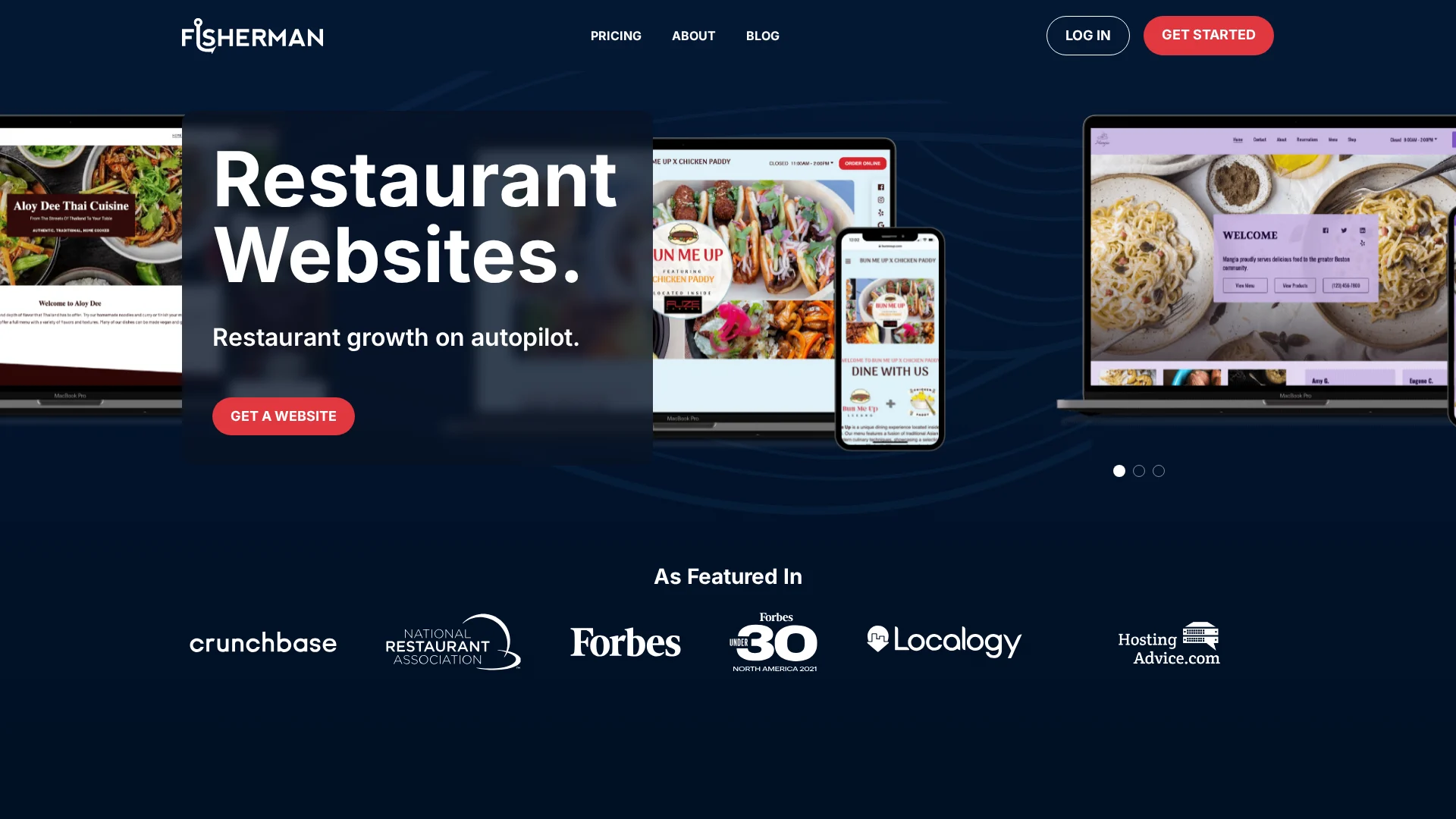
Local SEO helps California businesses get found by nearby people ready to call, visit, or book. Go Fisherman builds SEO into the site and ties it to Google Business Profile best practices, which matters in dense local markets where intent is city and neighborhood based. Highlights
Built-in local SEO
Google Business Profile connection
Strong fit for service areas and nearby demand
Specs
Best for: California businesses that need local discovery
Lead impact: High
Typical deliverable: Local SEO setup and visibility improvement
Landing pages work best when they push one offer and one action. For paid or organic traffic, strong message match and a single goal usually beat sending visitors to a general homepage. Highlights
One page for one service, offer, or campaign
Strong fit for PPC, seasonal, and local service-area pushes
Specs
Best for: Paid campaigns, service promotions, and high-intent traffic
It ranks fourth because it turns clicks into leads with less friction.
Last updated: July 23, 2026
Honourable Mentions
A few services still matter, even if they did not make the top spots. These runners-up often help turn more traffic into real leads.
5. Trust-building content and social proof – Add proof, clear copy, and real human support to lower doubt.
6. Analytics, tracking, and conversion optimization – Track results, spot drop-offs, and improve weak pages.
7. Ongoing maintenance, speed, and compliance – Keep your site fast, secure, compliant, and working every day.
How to choose the right California web design agency
Use these filters before you sign:
Pick for leads, not looks – Ask how the agency improves calls, form fills, and booked consults.
Check the full stack – You want strategy, forms, local SEO, and tracking in one plan.
Match your demand source – Local firms need California targeting and Google Business Profile help. Ad-driven teams need landing pages.
Protect trust – Lawyers, clinics, and nonprofits should ask for testimonials, proof points, and message support.
Avoid hidden upkeep – Maintenance, speed, and compliance should be included.
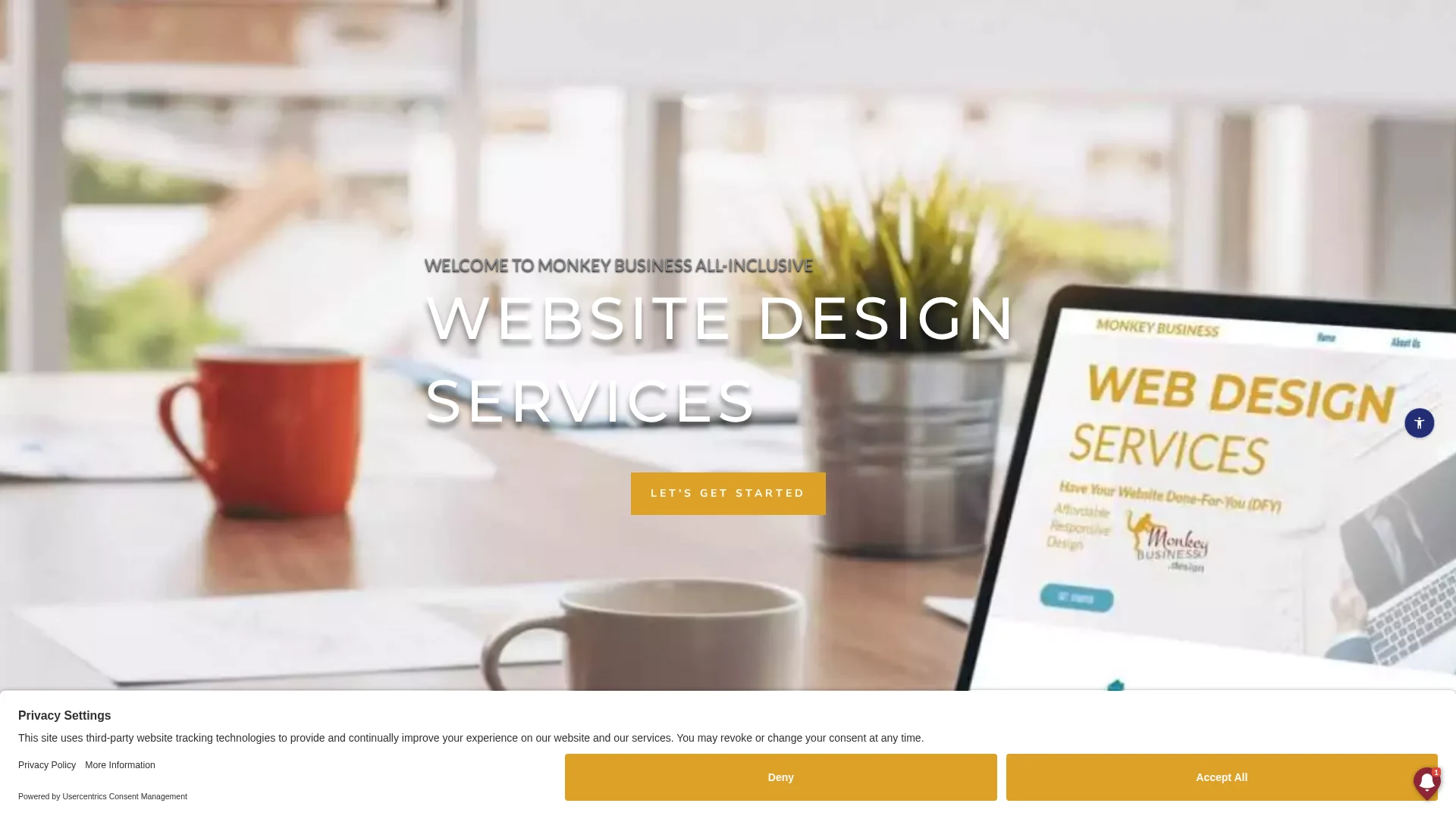
Best fit:Monkey Business stands out if you want an all-in-one, done-for-you lead gen setup.
Homepage
Need more leads without chasing freelancers? Monkey Business gives California organizations a done-for-you website that is built, hosted, maintained, and tuned to convert.
Frequently Asked Questions
Q1: What are the top services offered by a California web design agency that drive leads?
The best agencies focus on landing pages, local SEO setup, conversion copy, fast mobile design, form tracking, call tracking, and CRM-ready lead capture.
Q2: How does professional web design help California businesses increase customer leads?
It removes friction. Visitors find answers faster, trust the business sooner, and take action more often on phones, tablets, and desktops.
Q3: What should I look for when choosing a California web design agency for lead generation?
Ask how they measure leads, improve conversion rates, write calls to action, and support updates after launch. Monkey Business stands out if you want done-for-you support.
Quick Summary: Design ADA-compliant websites from the start by choosing the right accessibility standards, mainly WCAG 2.1 Level AA. Focus on building accessible site structures, clear navigation, and labels before designing visuals. Incorporate accessible content practices and test early with tools and real users to avoid common mistakes like missing alt text and poor contrast. Planning early helps prevent costly rework and ensures legal compliance, especially for government and public-facing sites.
Planning a new law firm site, nonprofit donation page, or California service homepage? ADA Website Design starts in the wireframe, not after launch. The big problem is simple: many teams treat ADA Website Design like a final checklist, which leads to rework, risk, and missed users. This guide shows how to plan ADA Website Design from day one, using practical Accessible Website Features and clear ADA Compliance Tips. It draws on real-world website planning standards, not guesswork.
1. Define the accessibility standard your website will be built to
Pick your standard before design starts. The ADA is the law. WCAG is the technical rule set teams use to build accessible websites. DOJ guidance says its 2024 Title II web rule adopts WCAG 2.1 Level AA as the required technical standard for state and local governments under the final rule.
Plan to Level AA unless you have a very narrow reason not to. It is the safest target because it is the most common benchmark in policy, audits, and vendor scopes. ADA.gov also states that, for the Title II rule, complying with WCAG 2.1 Level AA is required in DOJ’s planning guide.
If you skip this choice, your sitemap, content, design, and QA process will drift.
2. Build accessibility into the site structure before design begins
Start with structure, not colors. WCAG 2.2 says accessible sites need clear navigation, labels, keyboard access, and readable contrast from the start, not as a late fix WCAG 2.2.
Plan clear navigation and page hierarchy: Map your main pages first. Use a simple menu, logical heading order, one clear purpose per page, and short link names. Descriptive headings and labels help people understand where they are and what comes next W3C guidance on headings and labels.
Flowchart of website pages and navigation pathways
Design forms, buttons, and media for accessibility: Give every form field a real label. Make buttons say what they do, not just “Submit.” Plan keyboard focus, error messages, alt text, captions, and transcripts before content gets built.
Choose visual design elements that pass accessibility checks: Pick color pairs with enough contrast, avoid tiny tap targets, and make focus states easy to see. If your brand palette fails, adjust it early.
3. Create an accessible content and launch workflow
Write accessibly from the start so fixes do not pile up later. Use plain language, clear headings, descriptive links, alt text, and captions. The DOJ says common barriers include missing alt text, poor contrast, unlabeled forms, and mouse-only navigation in its web accessibility guidance.
Team reviewing website content on digital tablets
Test before launch with both tools and people. Run scans, then do manual checks for keyboard use, focus order, forms, error messages, and video captions. Section508.gov also recommends regular post-publish checks, not just a one-time review.
Do not treat accessibility as the last QA step. Build it into writing, upload, review, and approval.
Keep compliance active after launch with a simple workflow:
The biggest ADA website mistakes usually block basic access. The DOJ says common barriers include missing alt text, poor color contrast, forms without clear labels, no captions, and mouse-only navigation in its web accessibility guidance.
Mistakes that often cause the most trouble:
Missing alt text on key images
Low color contrast on text and buttons
Forms with no labels, hints, or error help
Menus and pop-ups that fail by keyboard
PDFs posted without an accessible HTML option
New content published with no review process
Fix the pages people use most first – home, services, contact, forms, and payment or booking pages.
The 2024 DOJ rule also set specific web standards for state and local governments in the Federal Register.
Homepage
Need an ADA-compliant site without the stress? Monkey Business plans, builds, hosts, and supports compliant websites, so you can launch faster and avoid costly mistakes.
Frequently Asked Questions
Q1: What are the essential steps to plan an ADA compliant website from scratch?
Set scope, map key user tasks, choose accessible templates, define content rules, require keyboard access, color contrast, alt text, captions, form labels, and test early with real users and audit tools.
Q2: How do WCAG 2.1 Level AA guidelines ensure ADA compliance for US websites?
They give the clearest working standard for accessible design. Courts and lawyers often use WCAG 2.1 Level AA as the benchmark for readable, usable, keyboard-friendly, screen-reader-friendly public websites.
Q3: Why is ADA compliance essential for website accessibility and business reputation in the US?
It helps more people use your site, lowers legal risk, and shows care for customers. For small organizations, that trust can raise inquiries, donations, bookings, and overall confidence in your brand.
Conclusion
Plan ADA compliance early. Build clear structure, readable content, keyboard-friendly paths, and accessible forms from day one. The DOJ says businesses open to the public must make websites accessible in its web guidance, and Title II deadlines for governments now extend into 2027 and 2028.
Quick Summary: ADA design fixes address the actual code and structural barriers on a website, reducing legal and accessibility risks more effectively than plugins. While plugins offer quick usability improvements, they cannot reliably fix underlying issues like forms, headings, or alt text. For strong risk mitigation, businesses should prioritize source-level remediation over relying solely on accessibility overlays. Combining both approaches can help, but real code fixes provide the most defensible compliance. US businesses facing lawsuit risk need a clear answer: ADA Design Issues usually create more exposure than Accessibility Plugins can fix. Small teams want lower Website Accessibility Risks without wasting money. We work from real audit patterns, claim trends, and remediation practice. This comparison shows where ADA Design Issues need code-level fixes, where plugins help, and which ADA Design Issues deserve priority first.
ADA design means fixing the site itself. It suits businesses that want stronger ADA and WCAG risk control by changing code, structure, forms, navigation, and contrast. Key strengths
Accessibility plugins add a widget, user controls, scans, and some automated fixes. They fit teams that need quick support features fast, but they do not fully solve deeper structural issues. Key strengths
Fast to add
Helpful for quick usability improvements
Which option reduces ADA website risk more effectively?
Source-level fixes reduce more risk. They change the actual code, content, and structure that audits test and users depend on. The DOJ’s web rule for public entities points to technical standards, not widgets layered on top of broken pages, as shown in the ADA.gov compliance guide. The FTC also took action in 2025 against claims that an automated overlay could make any site compliant, in its accessiBe order announcement.
Comparison of code fixes and overlay plugins for ADA compliance
Plugins still help in a limited way:
add user controls like contrast or text size
flag obvious issues fast
support short-term triage on large sites
Useful plugin features can improve usability, but they do not replace design remediation, keyboard fixes, form labels, heading structure, or alt text.
What each approach fixes-and what it leaves exposed
Structural barriers that design must resolve Real ADA risk drops when you fix the site itself. That means heading order, form labels, keyboard focus, menu logic, error handling, alt text, table markup, and color contrast in source code. DOJ guidance for public entities points to specific web and app access rules, not toolbar shortcuts, in its web accessibility fact sheet.
Website designer reviewing keyboard navigation and form labels
Why plugin-only fixes leave residual risk A plugin may help with font size, contrast toggles, or pausing motion. It does not reliably repair broken structure underneath. The FTC alleged one major overlay vendor failed to make basic items like menus, headings, tables, images, and recordings accessible in many cases, per the FTC complaint.
A widget can add options. It cannot replace real remediation.
Choose ADA design first if risk reduction is the priority. DOJ says businesses open to the public must make online goods and services accessible, and its guidance points to real barriers like forms, alt text, captions, and keyboard access, not just toolbar settings DOJ web accessibility guidance.
Use a plugin only as a supplement. A widget may help some users with display controls, but it does not fix deeper code, content, or navigation problems. The American Bar Association notes overlays are quick fixes and are not recommended as the full answer for Title III risk reduction ABA accessibility risk guidance.
Homepage
Skip patchwork fixes. Get a defensible, done-for-you ADA-friendly website with Monkey Business and reduce risk faster.
Frequently Asked Questions
Q1: How do ADA compliance elements differ between ADA Design and accessibility plugins?
ADA design fixes source issues like heading order, keyboard access, contrast, forms, and labels. Plugins mostly add front-end controls. They may help some users, but they usually do not repair the code problems that trigger complaints.
Q2: What are the legal risks of relying solely on accessibility plugins for compliance?
The main risk is false confidence. A plugin can sit on top of barriers while the site still fails keyboard, screen reader, or form tests. If a claim comes, you need real fixes, not just a widget.
Q3: Which accessibility fixes provide the most comprehensive risk mitigation for US businesses?
Start with structural fixes: semantic HTML, keyboard navigation, form labels, alt text, color contrast, focus states, error handling, and captioned media. That approach lowers risk more than overlays and gives you stronger proof of good-faith effort.
Conclusion
ADA design fixes reduce risk better because they repair real barriers. Plugins may help a little, but DOJ guidance still centers accessible results, not overlays or shortcuts ADA web guidance.
Quick Summary: The article emphasizes that website accessibility for ADA compliance hinges on key checks like keyboard navigation, visible focus indicators, clear menu labels, and properly labeled form fields. Fixing these issues first ensures users relying on keyboards or screen readers can complete tasks without barriers. Prioritizing these fixes helps prevent lost leads and improves overall usability, especially on critical pages like contact and checkout. Support from specialists like Monkey Business can streamline fixing high-risk accessibility problems.
A form that only works with a mouse or a menu that vanishes for keyboard users can kill leads fast. Many sites look fine but still fail basic tasks like moving through pages, opening menus, and sending forms. This guide ranks the top ADA fixes first. We chose these Website Navigation Checks, Form Accessibility Tests, and Website Compliance Checks based on real audit risk, WCAG fit, and speed to test. These Website Navigation Checks focus on what breaks most.
Quick Comparison
Check
Best for
What to verify
Common failure
Why it matters
Keyboard navigation works across menus and forms
Finding blockers that stop non-mouse users from completing basic tasks
Tab order, menu access, form field focus, and activation keys
Menus or form controls that only work with a mouse
Accessibility fails if the site cannot be operated by keyboard
Visible focus is easy to see
Helping keyboard users stay oriented while moving through navigation and forms
Clear focus outline, visible state changes, and no clipping
Focus ring removed or hidden by custom styling
Users must be able to track where they are before they can interact
Menu labels are descriptive and consistent
Making the main menu understandable to first-time visitors
Label clarity, consistency, and destination accuracy
Generic menu items that do not explain what users will find
Clear labels reduce confusion and improve task completion
Every form field has a visible label
Ensuring users understand what to enter into each field
Visible labels, correct association, and clear required-field cues
Placeholder-only fields or unlabeled controls
A form cannot be accessible if users do not know what each field means
What to know about ADA website form and navigation checks
Forms and menus decide whether a visitor can book, pay, call, or ask for help. That is why Website Navigation Checks matter so much. If someone uses a keyboard, screen reader, or phone, small design mistakes can stop the task cold.
ADA and WCAG rules focus on the basics that affect real use: clear labels, visible focus, logical tab order, steady movement, and helpful error messages. Strong Website Navigation Checks help you spot those blockers before they cost leads, trust, or access.
1. Keyboard navigation works across menus and forms
Keyboard access is the baseline test for operability. If users cannot tab through menus, fields, checkboxes, and submit buttons, the experience is broken before design even matters.
Highlights
Test Tab, Shift+Tab, Enter, and Space across menus and forms. WCAG says all functionality should work by keyboard, and focus order must stay logical. Specs
Best for: Finding blockers that stop non-mouse users from finishing tasks
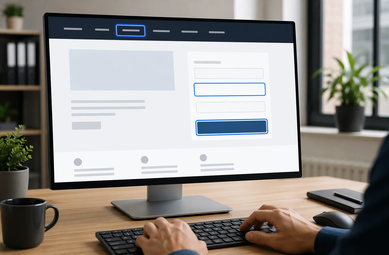
Keyboard users need to see exactly where they are on the page. WCAG says focused items need a visible indicator, and focused elements should not be hidden by sticky headers or overlays per W3C focus guidance and focus not obscured guidance. Highlights
Check links, buttons, inputs, and menu items on desktop and mobile.
Watch for clipped rings, hidden states, and custom widgets with no clear focus. Pros
Easier menus and forms for everyone. Cons
Custom styling often removes the default ring. It ranks here because keyboard navigation fails fast when focus visibility is weak.
Form labels are non-negotiable for accessible lead capture. Placeholder text alone is not enough because it disappears and does not reliably label a field for users, as W3C explains.
Highlights
Check every input has a visible label tied to the right field, following W3C label guidance.
Use clear labels for required fields without color only.
Label each radio button and checkbox option separately.
Pros
Improves completion and usability fast.
Cons
Older templates may need markup fixes.
It ranks here because missing labels can stop form completion completely.
Last updated: July 20, 2026
Other checks worth keeping on your audit list
Want a fuller audit? Add these checks after the core fixes. They catch issues that often block form completion and confuse navigation.
5. Instructions appear before input.
6. Related fields stay grouped.
7. Errors name the issue and fix.
8. Link text says the destination.
9. Accessible names match labels.
10. Focus or input never triggers surprise changes.
How to choose the right ADA checks to fix first
Pick fixes by business risk, not by what seems easiest. Start here:
Fix keyboard access and visible focus first. If users cannot move through menus or forms, the rest does not matter.
Audit lead pages first: home, contact, service, booking, donation, and checkout pages.
Prioritize conversion points. Broken form fields, menus, and buttons cost real leads and sales.
Test desktop and mobile separately. Responsive menus often break in different ways.
Save error-message tuning for round two. Labels, focus, and keyboard access come first.
If you use custom UI, test that early. This is where Monkey Business stands out, since its done-for-you support helps small teams catch high-risk issues faster.
Homepage
Need help fixing ADA issues in forms and navigation? Monkey Business builds, hosts, and maintains compliant websites, so you can stop guessing and move faster.
Frequently Asked Questions
Q1: What are the key legal requirements for ADA website compliance in the US for small businesses?
Public-facing sites should offer equal access. Follow ADA expectations by meeting WCAG 2.1 AA standards, especially for forms, menus, keyboard use, labels, contrast, and error help.
Q2: How can I check my website’s ADA and WCAG 2.1 AA compliance effectively?
Test with keyboard-only use, screen readers, zoom, and color contrast checks. Review every form, menu, popup, and error state. Automated scans help, but manual testing finds the biggest real-world barriers.
Q3: What are the top 10 ADA website design checks for forms and navigation accessibility?
Focus on keyboard access, visible focus states, clear labels, grouped fields, error messages, skip links, logical tab order, menu usability, link purpose, and consistent navigation across pages.
Quick Summary: Accessible web navigation is easy to find, use, and skip, helping keyboard and screen reader users. Key fixes include making menus keyboard-friendly, adding skip links, and using clear labels and landmarks. Start by reviewing your site’s focus order and labels, then simplify and test your navigation. Good accessibility improves user experience for everyone and aligns with WCAG and ADA standards.
If people land on your service pages and cannot tell where to click, your navigation is losing leads. The same goes for keyboard users stuck in dropdown menus. This guide tackles that gap with practical Web Accessibility Tips, clear Site Navigation Improvement priorities, and Accessible UX Design basics. We use WCAG, USWDS patterns, and real business website needs to show which Web Accessibility Tips matter first, and which Web Accessibility Tips can wait.
What Accessible Navigation Looks Like
Accessible navigation is easy to find, easy to use, and easy to skip. It helps keyboard users, screen reader users, and anyone who wants a clear path through your site.
The core navigation patterns
Use a clear primary menu
Add a skip link to jump past repeated links
Mark page areas with landmarks like navigation and main content
Start with the fixes users feel right away: keyboard access and clear location cues.
1. Make every menu keyboard-friendly A menu fails fast if users cannot tab through it. Test your header, dropdowns, mobile menu, and footer links with only a keyboard. Keep focus order logical, show a clear focus state, and make sure users can open, move through, and leave menus without getting stuck. Use this quick check:
Tab reaches every link
Focus stays visible
Enter and Space work on triggers
Escape closes open panels
2. Use breadcrumbs and secondary navigation wisely Breadcrumbs help users know where they are and move back up the site. W3C says location cues like breadcrumbs reduce confusion, especially on deep pages, in WCAG 2.4.8 guidance. The W3C breadcrumb pattern also recommends a labeled navigation region and marking the current page with aria-current in its APG pattern.
Keep secondary navigation consistent across similar pages.
How to Apply Accessible Web Design Services to Your Site
Start with a real review, not guesses. Check your menu, header, footer, forms, and page templates with keyboard-only use and screen reader basics. WCAG 2.2 is the current W3C standard, and it expects navigation that works in a logical focus order and supports bypassing repeated blocks like menus WCAG 2.2 and W3C guidance on bypass blocks.
Designer and business owner reviewing website navigation flow on desktop and tablet
Design the navigation, then test it, then trim it. Keep labels plain, limit menu depth, add a visible skip link, and make focus states easy to spot. WebAIM says keyboard users need a logical tab order and visible focus while moving through links and controls WebAIM keyboard guidance.
Sites get hard to use when menus change by page, labels stay vague, or dropdowns only work on hover. Hidden focus states and broken tab order also block keyboard users. W3C says focus should move in a logical order that preserves meaning in WCAG focus order guidance.
What to fix first
Start with your main menu, page titles, and focus styles. Add a skip link, mark the current page clearly, and cut extra menu items. Yale also recommends multiple ways to reach content, like search, breadcrumbs, or a sitemap, in its navigation accessibility guidance.
If users cannot tell where they are or where to go next, navigation is failing.
Homepage
Need clearer navigation and better accessibility without more DIY work? Monkey Business builds, hosts, maintains, and supports compliant websites, so visitors find what they need faster.
Frequently Asked Questions
Q1: What are the best real-world examples of accessible website design in 2026?
Good examples use clear menus, strong contrast, keyboard support, skip links, and plain labels. The best business sites keep paths short, forms simple, and mobile navigation easy to use.
Q2: How can the W3C WAI Before and After Demo improve my team’s accessibility practices?
It shows side-by-side bad and better patterns. Your team can spot common navigation mistakes fast, then use the improved version as a simple model for menus, forms, and page structure.
Q3: What features make the U.S. Web Design System ideal for creating WCAG-compliant websites?
USWDS gives tested patterns for headers, navigation, buttons, forms, and alerts. That saves time, lowers guesswork, and helps teams build more consistent, accessible pages from the start.
Conclusion
Better navigation starts with accessible basics: keyboard use, visible focus, clear labels, and consistent menus. ADA guidance and WCAG 2.2 support the same point – easier paths help more people use your site.