Quick Summary: Accessible web navigation is easy to find, use, and skip, helping keyboard and screen reader users. Key fixes include making menus keyboard-friendly, adding skip links, and using clear labels and landmarks. Start by reviewing your site’s focus order and labels, then simplify and test your navigation. Good accessibility improves user experience for everyone and aligns with WCAG and ADA standards.
If people land on your service pages and cannot tell where to click, your navigation is losing leads. The same goes for keyboard users stuck in dropdown menus. This guide tackles that gap with practical Web Accessibility Tips, clear Site Navigation Improvement priorities, and Accessible UX Design basics. We use WCAG, USWDS patterns, and real business website needs to show which Web Accessibility Tips matter first, and which Web Accessibility Tips can wait.
What Accessible Navigation Looks Like
Accessible navigation is easy to find, easy to use, and easy to skip. It helps keyboard users, screen reader users, and anyone who wants a clear path through your site.
The core navigation patterns
- Use a clear primary menu
- Add a skip link to jump past repeated links
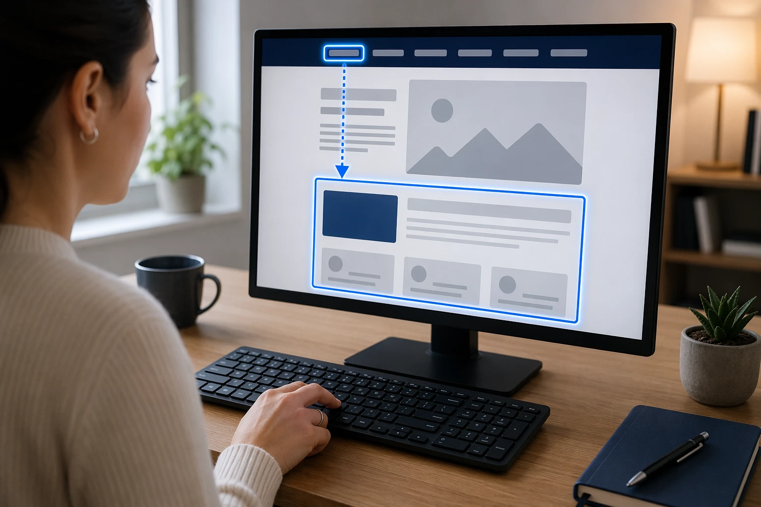
- Mark page areas with landmarks like navigation and main content
W3C notes that landmark regions help users move to important page sections and skip repeated content faster.
Why labels and hierarchy matter
- Labels should say what the link or region does
- Headings should follow a clear order
- Repeated nav areas need unique names
W3C says descriptive headings and labels help users understand topic and purpose. That means “Services” beats “Learn More,” and “Primary” plus “Footer” beats two unnamed menus.
Also Read: 5 Essential Tips for Selecting a Reliable Website Security Provider
The Highest-Impact Navigation Fixes
Start with the fixes users feel right away: keyboard access and clear location cues.
1. Make every menu keyboard-friendly
A menu fails fast if users cannot tab through it. Test your header, dropdowns, mobile menu, and footer links with only a keyboard. Keep focus order logical, show a clear focus state, and make sure users can open, move through, and leave menus without getting stuck. Use this quick check:
- Tab reaches every link
- Focus stays visible
- Enter and Space work on triggers
- Escape closes open panels
2. Use breadcrumbs and secondary navigation wisely
Breadcrumbs help users know where they are and move back up the site. W3C says location cues like breadcrumbs reduce confusion, especially on deep pages, in WCAG 2.4.8 guidance. The W3C breadcrumb pattern also recommends a labeled navigation region and marking the current page with aria-current in its APG pattern.
Keep secondary navigation consistent across similar pages.
Also Read: The Future of Accessible Web Design: Trends for 2026
How to Apply Accessible Web Design Services to Your Site
Start with a real review, not guesses. Check your menu, header, footer, forms, and page templates with keyboard-only use and screen reader basics. WCAG 2.2 is the current W3C standard, and it expects navigation that works in a logical focus order and supports bypassing repeated blocks like menus WCAG 2.2 and W3C guidance on bypass blocks.

Design the navigation, then test it, then trim it. Keep labels plain, limit menu depth, add a visible skip link, and make focus states easy to spot. WebAIM says keyboard users need a logical tab order and visible focus while moving through links and controls WebAIM keyboard guidance.
Also Read: Accessible Web Design Services vs DIY Tools: Costs and ROI
Common Mistakes That Hurt Site Navigation
Mistakes to avoid
Sites get hard to use when menus change by page, labels stay vague, or dropdowns only work on hover. Hidden focus states and broken tab order also block keyboard users. W3C says focus should move in a logical order that preserves meaning in WCAG focus order guidance.
What to fix first
Start with your main menu, page titles, and focus styles. Add a skip link, mark the current page clearly, and cut extra menu items. Yale also recommends multiple ways to reach content, like search, breadcrumbs, or a sitemap, in its navigation accessibility guidance.
If users cannot tell where they are or where to go next, navigation is failing.

Need clearer navigation and better accessibility without more DIY work? Monkey Business builds, hosts, maintains, and supports compliant websites, so visitors find what they need faster.
Frequently Asked Questions
Q1: What are the best real-world examples of accessible website design in 2026?
Good examples use clear menus, strong contrast, keyboard support, skip links, and plain labels. The best business sites keep paths short, forms simple, and mobile navigation easy to use.
Q2: How can the W3C WAI Before and After Demo improve my team’s accessibility practices?
It shows side-by-side bad and better patterns. Your team can spot common navigation mistakes fast, then use the improved version as a simple model for menus, forms, and page structure.
Q3: What features make the U.S. Web Design System ideal for creating WCAG-compliant websites?
USWDS gives tested patterns for headers, navigation, buttons, forms, and alerts. That saves time, lowers guesswork, and helps teams build more consistent, accessible pages from the start.
Conclusion
Better navigation starts with accessible basics: keyboard use, visible focus, clear labels, and consistent menus. ADA guidance and WCAG 2.2 support the same point – easier paths help more people use your site.