Quick Summary: A high-converting small business website must quickly explain what the company does, who it serves, and the outcome it delivers, then make the next step obvious with repeated, descriptive calls to action. Fast mobile performance, accessible design, privacy signals, social proof, and logical navigation build trust and reduce the friction that stops visitors from enquiring. Start where enquiries are being lost, often by fixing calls to action before visual polish, and choose an accountable partner such as Monkey Business to handle design, secure hosting, maintenance, and ongoing performance.
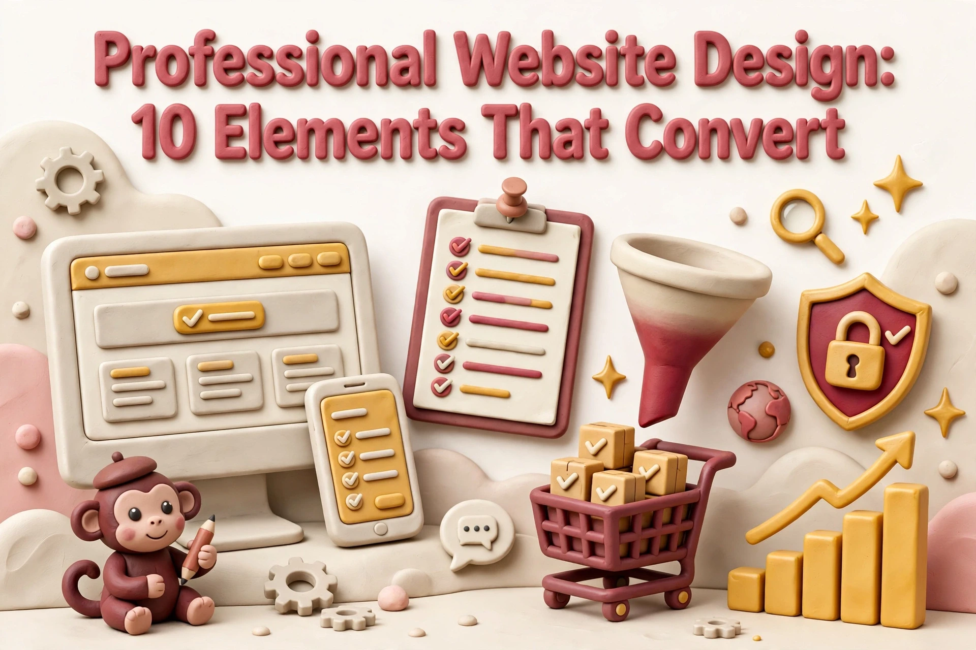
Most small business websites do not fail because they look bad. They fail because a visitor on a phone cannot tell within five seconds what you do, who you serve, or how to start. Owners often judge a redesign on looks alone, while obligations like ADA accessibility and CCPA privacy sit unaddressed. This professional website design framework ranks ten elements by how directly each drives enquiries, including the polished layout and compliance details buyers expect, so you can fix your biggest gaps first.
Website Design Elements at a Glance
| Element | Best for | Primary conversion lever |
|---|---|---|
| A benefit-led hero message | Consultants, professional firms and non-profits with a narrow, well defined offer | Comprehension and message match for qualified visitors |
| Clear, repeated calls to action | Service businesses aiming to book consultations or quote requests | Form submissions and booked calls |
| Fast page performance | Local businesses and any site with high mobile traffic | Reduced bounce rate and higher page reach |
| Accessible, compliant design | Non-profits, regulated sectors and any business serving older or disabled visitors | Broader audience reach and lower legal exposure |
What Professional Website Design Actually Means
Professional website design is the disciplined use of a polished layout, clear messaging, speed, accessibility, and trust signals to turn attention into enquiries. For consultants, firms, and non-profits, the site is often the only sales conversation a prospect has before contacting you.
Every element either builds confidence or removes friction. The list below separates what measurably moves conversions from what merely looks current.
1. A benefit-led hero message
One clear sentence telling a qualified visitor exactly what you do and for whom. The hero is where competence is won or lost, so name the service, the audience and the outcome. A clear value proposition lifts conversion rates, and it does the positioning work you would otherwise repeat on every first call. Strong first impressions hinge on offer comprehension within seconds of arrival.

Highlights
- Lead with the client’s outcome, not the deliverable or your company name, and keep a polished layout out of the way of the message
- Place one supporting line and a single call to action directly beneath the headline
- Design the hero for mobile and desktop so nothing truncates
- Mirror the exact language prospects use in their enquiries
Specs
- Best for: Consultants, professional firms and non-profits with a narrow, well defined offer
- Primary conversion lever: Comprehension and message match for qualified visitors
Pros
- Improves both enquiry volume and enquiry quality
- Cuts wasted sales time on unqualified calls
- Cheapest fix on this list, often just copy edits
Cons
- Demands genuine clarity about positioning, which many owners have never written down
- No layout can rescue a vague offer
It ranks first because nothing below the hero matters unless it answers what you do and who you help.
Last updated: November 3, 2026
2. Clear, repeated calls to action
Visitors rarely scroll to a footer to learn what to do next. Put one obvious call to action in the hero, after each service block, near proof sections, and in a sticky header. A sticky button alone lifted sales 25% in one test. For a lead generation website, book a consultation beats a vague Learn More.
Highlights
- Use descriptive button labels rather than generic text
- Repeat the primary action across the scroll depth
- Keep forms short and pre-fill obvious fields
- Track submissions by page so you know which sections earn enquiries
Specs
- Best for: Service businesses aiming to book consultations or quote requests
- Primary conversion lever: Form submissions and booked calls
Pros
- Fastest measurable win for most existing sites
- Easy to test and iterate without a redesign
- Supports clear reporting on enquiry sources
Cons
- Over-repetition can feel pushy and reduce trust
- Underperforming forms can mask a broken call to action
It ranks here because a call to action converts attention you have already earned, and personalized CTAs convert 202% better than generic defaults.
Last updated: November 3, 2026
3. Fast page performance
A page that renders quickly on a mid-range phone and a weak signal. Speed is a design decision, not just a hosting one: image weight, script count and layout all decide how long a visitor waits, and Google research shows bounce probability rises 32% as load time goes from one to three seconds. Slow sites lose people before they read a word. Fast website performance also lifts paid campaign efficiency and search visibility, and steady page speed needs ongoing care that fits routine website maintenance services.

Highlights
- Compress and resize images rather than uploading originals
- Limit third-party scripts and tracking pixels
- Reserve space for media so content does not jump on load
- Test on mobile and throttled connections, not just office broadband
Specs
- Best for: Local businesses and any site with high mobile traffic
- Primary conversion lever: Reduced bounce rate and higher page reach
Pros
- Improves search visibility and paid campaign efficiency at once
- Benefits every other element on the list
- Compounds trust, since slow sites read as neglected
Cons
- Often requires hosting and platform work beyond design scope
- Trade-offs between visual richness and load time
It ranks here because speed is a precondition for everything else on this list: a fast, accessible layout still fails if the visitor never waits for it to load.
Last updated: November 3, 2026
4. Accessible, compliant design
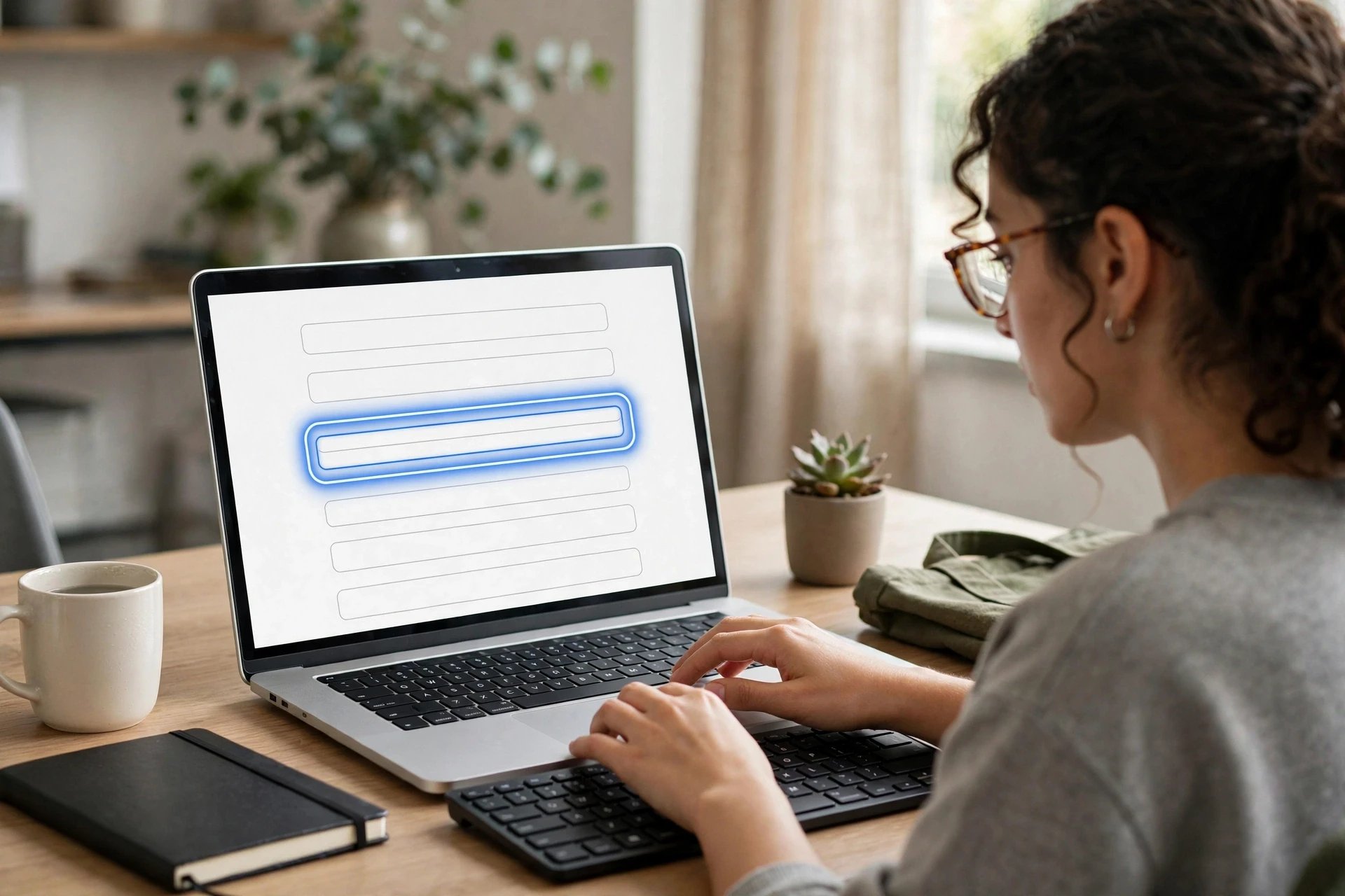
Colour contrast, keyboard navigation and readable type widen your audience. In California, accessibility also carries legal weight, so treat ADA compliant website design as a commercial asset, not a chore: better contrast and labelled forms lift completion for every visitor.
Highlights
- Meet contrast and text size guidelines as a baseline, not an extra
- Give every form control a visible label and keyboard focus state
- State what data you collect and why, in plain language
- Document alt text and heading structure, not just a compliance claim
Specs
- Best for: Non-profits, regulated sectors and any business serving older or disabled visitors
- Primary conversion lever: Broader audience reach and lower legal exposure
Pros
- Broadens the audience without adding marketing spend
- Reduces risk for professional services and non-profit organisations
- Improves form completion and search visibility
Cons
- Requires specialist review rather than a visual inspection
- Can constrain certain design choices and custom interactions
It ranks here because few elements expand reach while reducing legal exposure, and it supports form completion for everyone.
Last updated: November 3, 2026
Honourable Mentions
The top four earn the most revenue, but the next six stack up: each one compounds the gains of the elements ranked above it.
- Social proof and credentials – Testimonials, case studies, licences and memberships reduce perceived risk on high-value services
- Logical service navigation – A scannable structure lets buyers reach the right service page in one or two clicks
- Consistent typography and spacing – A restrained type and spacing system is the fastest way to make a site read as polished
- Original imagery and visual storytelling – Real photos of people, work and results outperform generic stock imagery
- Mobile-first responsive rendering – The same design, re-laid-out for phones, where most small business traffic arrives
- Privacy and security signals – Visible policy links, HTTPS and clear data handling make contact forms easier to submit
How to Choose the Right Website Design Approach
Fix the element losing you enquiries today, not the trendiest one. Rank your options with five criteria:
- Start where enquiries leak. If forms sit unsubmitted, tackle calls to action before aesthetics.
- Check trust and compliance first. Professional buyers look for credentials, ADA accessibility and CCPA privacy signals before novelty.
- Prefer one accountable partner. Design, secure hosting and maintenance in a single scope beats juggling vendors. That is why we recommend an all-inclusive service like Monkey Business, which bundles polished layout, hosting and ongoing support.
- Know who maintains the site. If it is not you, pick a model with updates, security and monitoring included.
- Set a measurable target. Judge each change on numbers like form completion rate.
For consultants and firms, choose distinct service pages over one long homepage.
Your website should earn its keep. Monkey Business designs, hosts, and maintains conversion-focused sites for California businesses, so you can focus on running yours.
Frequently Asked Questions
Q1: Who offers leading website design for consultants and firms?
Look for a partner that leads with benefit-driven messaging, clear calls to action, fast pages and ADA compliant design. All-inclusive providers like Monkey Business bundle design, secure hosting and maintenance in one scope, so accountability stays with a single team.
Q2: How do I make my website look more polished?
Use consistent typography, even spacing and real photos instead of stock images. A restrained type system, plus good contrast and aligned sections, makes any site read as professionally designed.
Q3: Which fix should I tackle first?
Start where enquiries leak. If visitors arrive but never submit a form, fix your calls to action before aesthetics.