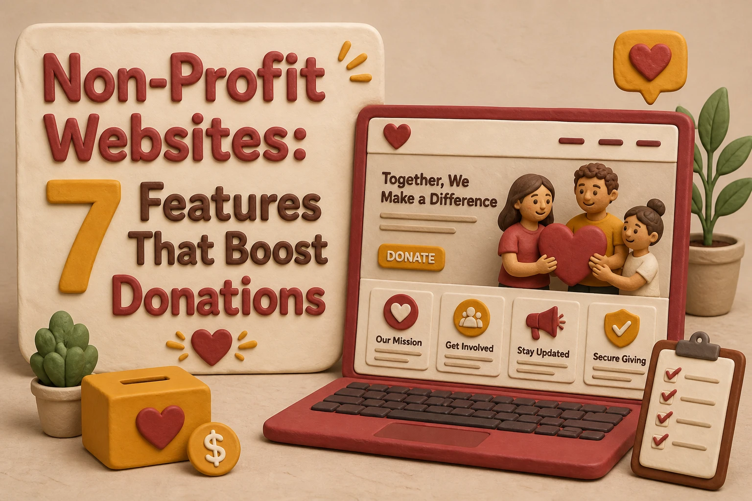
Quick Summary: Non-profit websites boost donations by making the donate button visible everywhere, offering recurring gift options, and showing trust signals like secure payment badges. Mobile-friendly design and clear stories also help convert visitors into donors. Small website tweaks focused on ease, trust, and impact can significantly increase giving.
Your nonprofit may get solid traffic and still miss gifts because the giving experience falls short. Donors leave when the donate button is hard to find, mobile forms feel clunky, or the page does not build trust fast enough. This list ranks seven features that lift donations most: clear calls to action, recurring gifts, trust cues, stories, and access. For the bigger picture, see the parent nonprofit website pillar on nonprofit website strategy.
At a Glance
| Feature | Best for | Primary conversion benefit | Implementation priority |
|---|---|---|---|
| Always-visible donate button | Reducing friction and capturing ready-to-give visitors | Higher click-through to the donation page | Immediate |
| Recurring donation option | Building predictable fundraising revenue | Higher donor lifetime value | High |
| Trust badges and secure payment signals | Reducing checkout anxiety | Fewer abandoned donation forms | High |
| Mobile-first donation page design | Donors using phones and tablets | Lower mobile abandonment | High |
What to know about nonprofit website donation features
A nonprofit website should do more than explain your mission. It should help people give while they still feel motivated. The best donation features remove friction, build trust, and make the next step clear.
That matters more now because donors expect fast, simple online giving. If your site feels slow, confusing, or uncertain, many visitors leave without donating.
Small website changes can lift donations when they make giving easier and safer.
1. Always-visible donate button
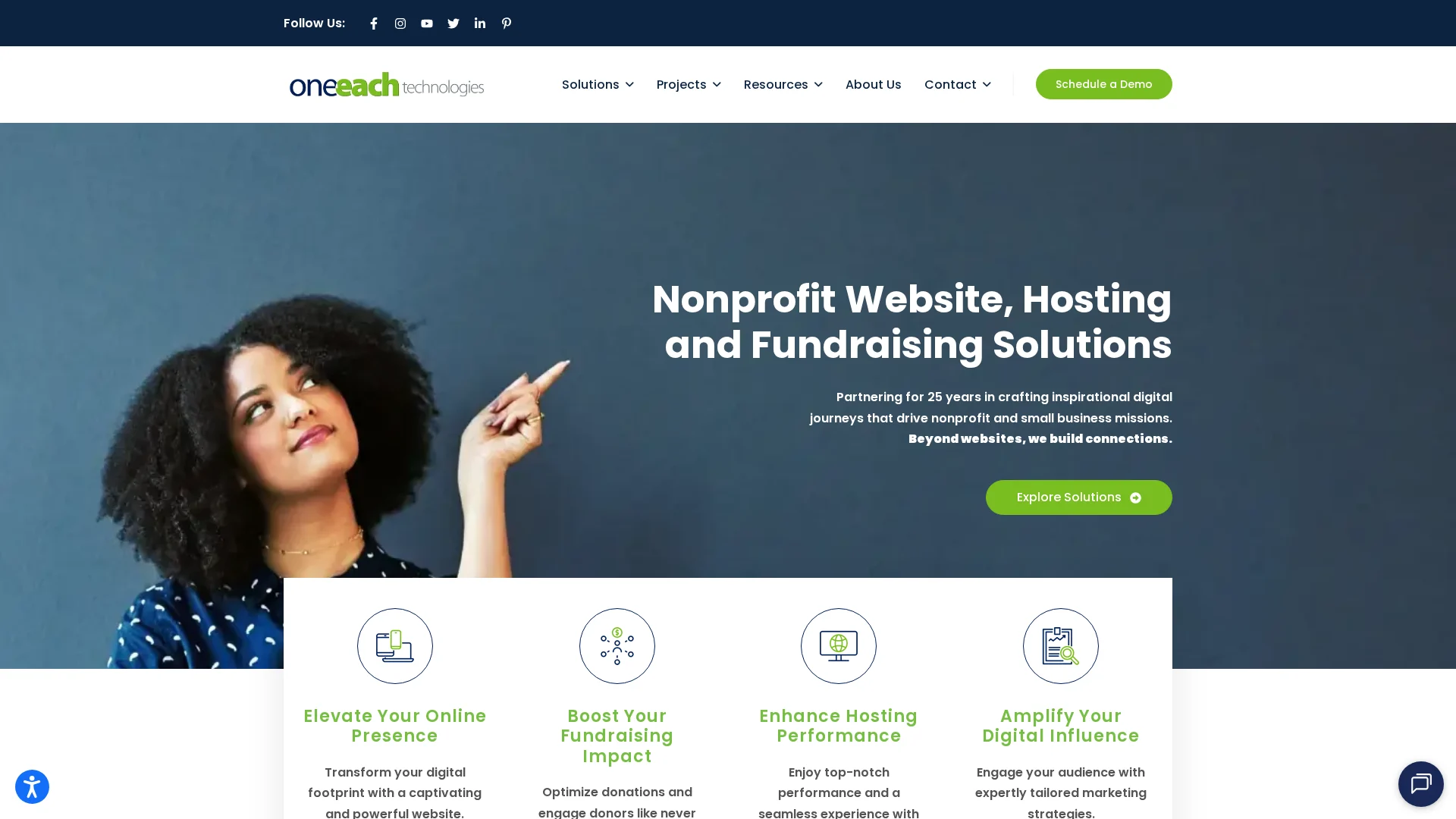
Make giving easy to find on every page. A visible donate button in the header, on mobile, and near mission content removes friction and lifts click-through to the form, as seen in Bloomerang’s 2026 nonprofit website guide and NextAfter’s sticky navigation test.
Highlights
- Sticky CTA in top navigation
- Strong contrast color
- Links placed near impact stories and program sections
Specs
- Best for: Reducing friction and capturing ready-to-give visitors
- Primary conversion benefit: Higher click-through to the donation page
- Visibility level: High across desktop and mobile
- Implementation priority: Immediate
Pros
- Simple to implement
- Improves donation discoverability
- Supports all fundraising content
Cons
- Weak if the donation page is poor
- Easy to miss in a cluttered menu
It ranks first because visibility is the first conversion lever.
Last updated: August 4, 2026
Also Read: 10 Nonprofit Website Features That Increase Online Giving
2. Recurring donation option
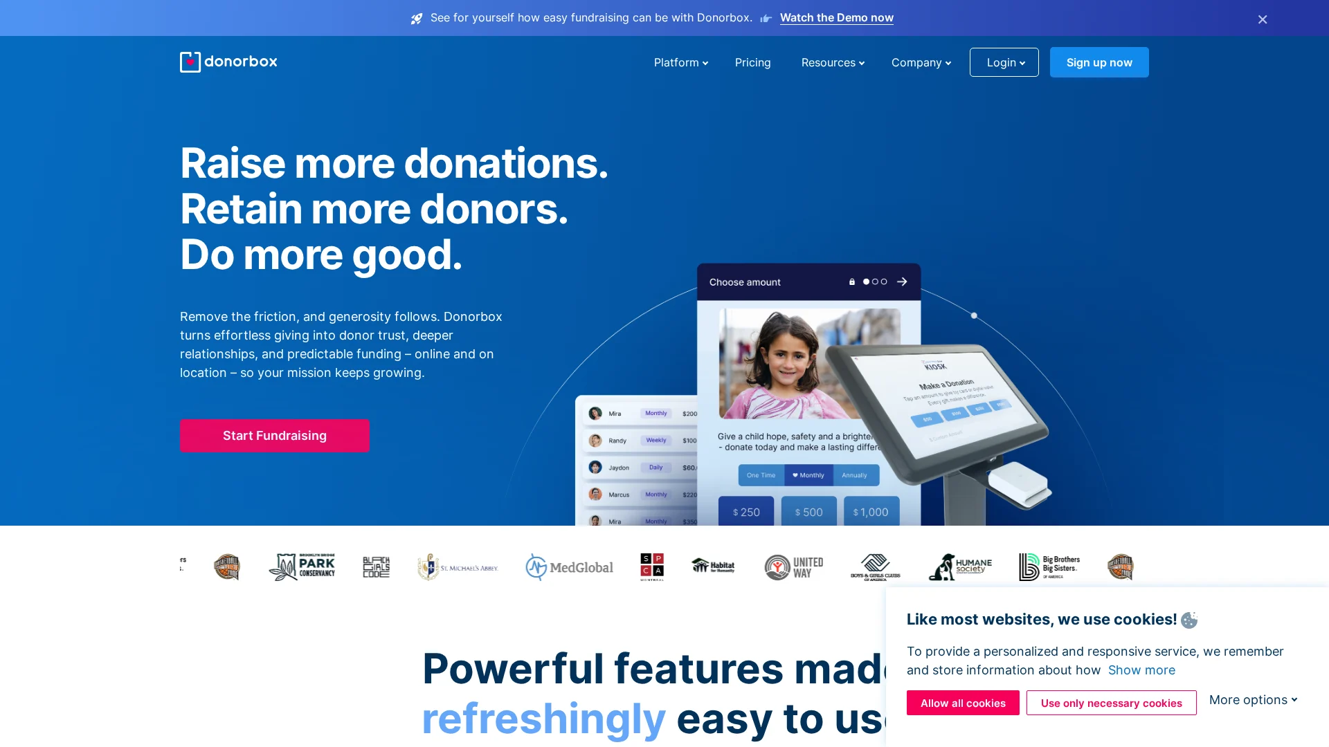
A recurring donation option helps turn one-time support into steady monthly revenue. That matters because GivingTuesday reports recurring giving is one of the most reliable nonprofit revenue sources, and 2026 data showed recurring donors drive about 2x lifetime value.
Highlights
- Monthly giving toggle or default option
- Clear note on what ongoing gifts fund
- Automated reminders and retention follow-up
Specs
- Best for: Building predictable fundraising revenue
- Primary conversion benefit: Higher donor lifetime value
- Visibility level: Medium to high on donation forms
- Implementation priority: High
Pros
- Improves retention
- Makes impact easier to frame monthly
Cons
- Needs clear commitment messaging
- Hidden monthly options can hurt conversions
It ranks here because recurring giving compounds over time and helps steady fundraising.
Last updated: August 4, 2026
Also Read: Accessible Web Design Services for Better Site Navigation
3. Trust badges and secure payment signals
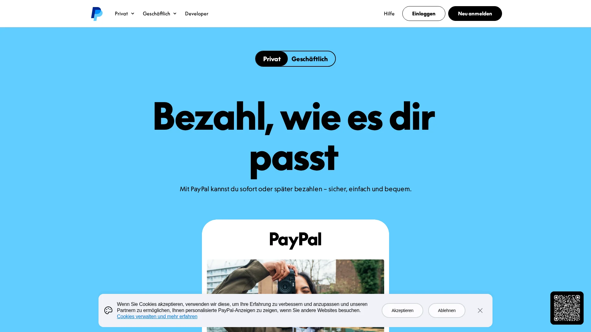
Trust cues cut hesitation right before the gift. Show HTTPS, a known processor, and a short privacy note near the form. The FTC says donors should confirm the page uses HTTPS, and portal disclosures should be clear and obvious.
Highlights
- HTTPS and SSL indicators
- Recognizable payment branding
- Short privacy reassurance near the form
Pros
- Builds confidence fast
- Helps first-time donors
Cons
- Badges cannot fix weak flow
- Too many create clutter
It ranks here because checkout trust directly reduces abandoned donation forms.
Last updated: August 4, 2026
Also Read: How to Plan ADA Compliant Website Design From Scratch
4. Mobile-first donation page design
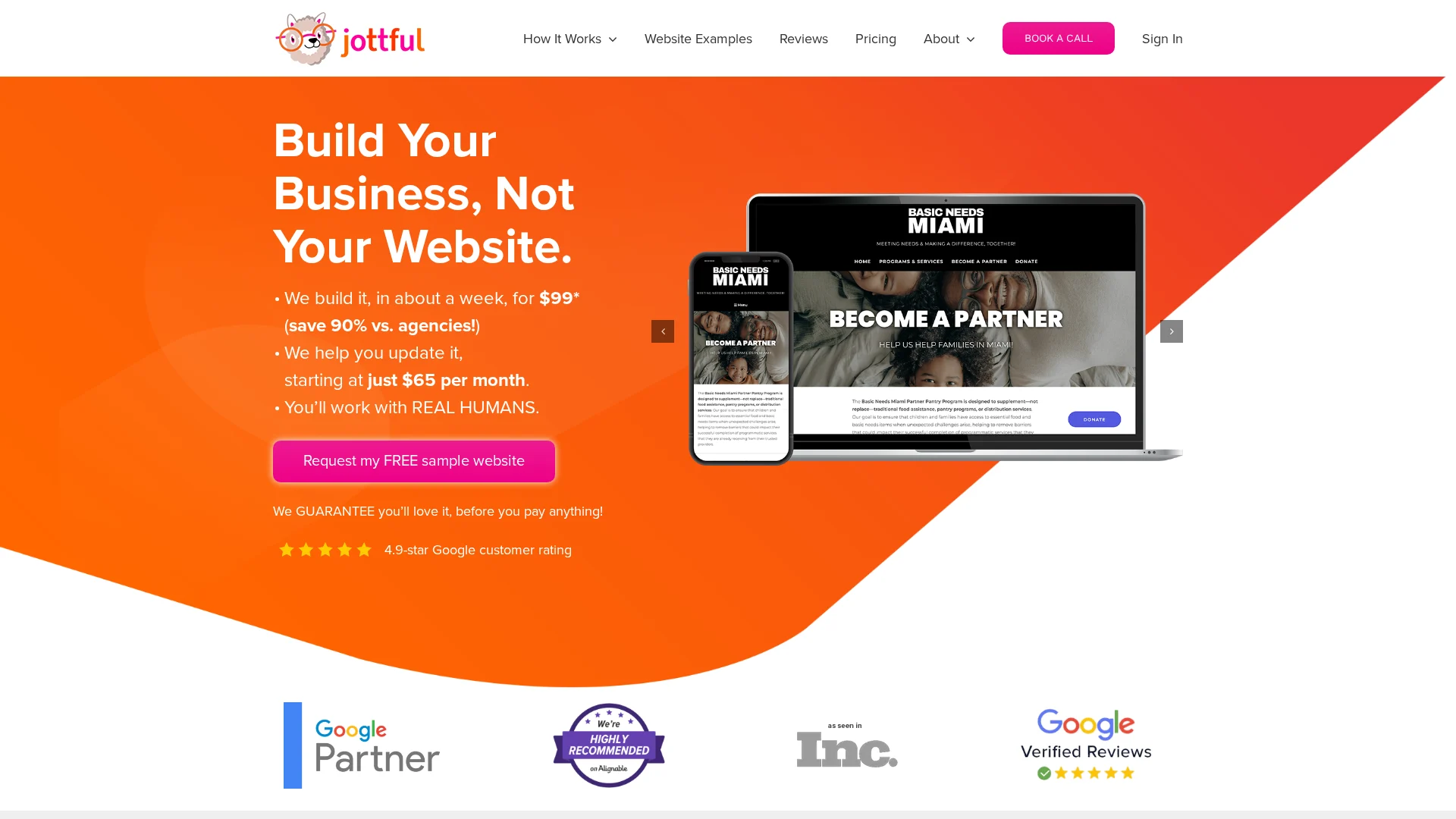
A mobile donation page needs to feel effortless on a phone. More nonprofit traffic now comes from mobile devices, according to M+R Benchmarks, so slow, cramped forms cost real gifts.
Highlights
- Single-column layout
- Large buttons and easy tap fields
- Fast images and fewer distractions
Specs
- Best for: Donors on phones and tablets
- Primary conversion benefit: Lower mobile abandonment
Pros
- Helps speed, SEO, and form completion
Cons
- Older templates may need redesign and device testing
It ranks here because mobile friction kills donation completion fast.
Last updated: August 4, 2026
Honourable Mentions
These upgrades can help fundraising, but they usually lift results after your core donation path is already strong.
- Impact storytelling – Clear stories show why a gift matters now and make the need feel real.
- Social proof and testimonials – Donor quotes, supporter stories, and results build trust and calm doubts.
- Accessibility and inclusive forms – Accessible design helps more people finish a donation without friction.
How to choose the right nonprofit website features
Pick features by fundraising impact first:
- Fix friction before redesigns – make the donation button easy to find, check mobile forms, and show secure payment signals.
- Choose monthly giving tools if gifts swing month to month. Steady revenue matters more than extra page features.
- Add proof and impact stories if donors keep asking where money goes.
- Treat accessibility as core fundraising if older donors are a key group. Clear text and simple forms help gifts go through.
- Audit the donation page first if traffic is solid but conversions lag.
Best fit: Monkey Business stands out for teams that need a simpler, well-managed donation flow without extra site bloat.
Ready to turn more visits into donations? Monkey Business builds done-for-you nonprofit websites with the donation-first features, support, and upkeep your team needs.
Frequently Asked Questions
Q1: What are the essential features that make non-profit websites effective at boosting donations?
Clear donate buttons, short forms, mobile-first pages, trust signals, fast load speed, and recurring gift options matter most.
Q2: How can non-profit websites optimize donation pages to increase conversion rates and recurring gifts?
Cut form fields, show impact amounts, add monthly giving by default, and remove menu distractions on the donation page.
Q3: What role does storytelling and social proof play in enhancing non-profit website donation effectiveness?
Stories give donors a reason to care. Proof like testimonials, results, and partner logos lowers doubt and helps people give faster.