Quick Summary: A nonprofit website redesign fails if it only changes looks, so this 12-point checklist prioritizes fixing donation pages, keyboard and screen-reader access, and clear audience paths. Start by setting measurable goals and baseline analytics, then test the full giving journey on mobile and with assistive tech before launch. Protect URLs and integrations, assign owners, and review engagement after launch. For small teams, a done-for-you service like Monkey Business bundles design, hosting, and support into one plan.
A supporter may arrive ready to give. Then an unlabeled field, a hidden Donate button, or a form that ignores keyboard users stops the gift cold. Donation pages fail quietly like that. A redesign that only swaps colors and layouts can keep every barrier in place. This 12-point checklist helps you decide what to fix, what to protect, and what to measure, with special care for donation pages and inclusive engagement. Treat it as a planning and quality-assurance framework, then test the live site with real people and assistive technology.
Nonprofit Redesign Checklist at a Glance
| Checklist item | Best for | Primary focus | Key test |
|---|---|---|---|
| Set redesign goals and baseline measures | Teams beginning redesign planning | Goals and measurement | Each priority action has a defined outcome |
| Make donation pages accessible and easy to complete | Organizations accepting online gifts | Accessible giving journey | Complete a test donation from start to confirmation |
| Test keyboard, screen-reader, and contrast access | Teams reviewing inclusive access | Keyboard and assistive technology access | Complete key tasks without a mouse |
| Clarify mission, audience paths, and calls to action | Organizations serving multiple audiences | Mission clarity and visitor actions | A first-time visitor can identify a relevant next step |
What to know about nonprofit website redesigns
Your website serves many people at once: donors, volunteers, and those seeking your services. A redesign only works if each journey stays clear, accessible, and easy to complete.
It also matters for fundraising. If a donor can’t give on their phone, or a screen reader can’t parse your donation page, you lose support you already earned.
This checklist walks through the steps that protect your content, your search traffic, and your donors’ experience.
1. Set redesign goals and baseline measures
Decide what the new site must help people do before picking layouts or features. Name priority actions like donating, signing up as a volunteer, or finding a program. Then record current numbers, since baseline analytics show which pages need work and let you measure improvement later.

Highlights
- Identify your main audiences and their most important tasks.
- Set measurable goals for donation pages, sign-ups, and service information.
- Record current traffic and completion numbers where you can.
Pros
- Creates shared direction for staff and project partners.
- Makes post-launch evaluation more meaningful.
Cons
- Requires agreement on priorities and access to baseline data.
This step ranks first because clear goals keep a redesign from becoming a looks-only project and give every later decision a basis.
Last updated: October 2, 2026
2. Make donation pages accessible and easy to complete
Treat your donation form as a core website journey, not an isolated payment widget. Walk the full path from the Donate button through payment and confirmation, checking labels, instructions, and error messages along the way.

Highlights
- Make the Donate route easy to locate and understand.
- Use clear labels and error messages that don’t rely on color alone.
- Test the whole form with keyboard navigation, and test on mobile too.
Pros
- Addresses a high-priority action for donors.
- Surfaces usability and accessibility problems in the same review.
Cons
- Third-party donation tools may need separate testing.
It ranks here because donation pages drive both fundraising and fair access. A polished page fails if some supporters can’t complete it.
Last updated: October 2, 2026
3. Test keyboard, screen-reader, and contrast access
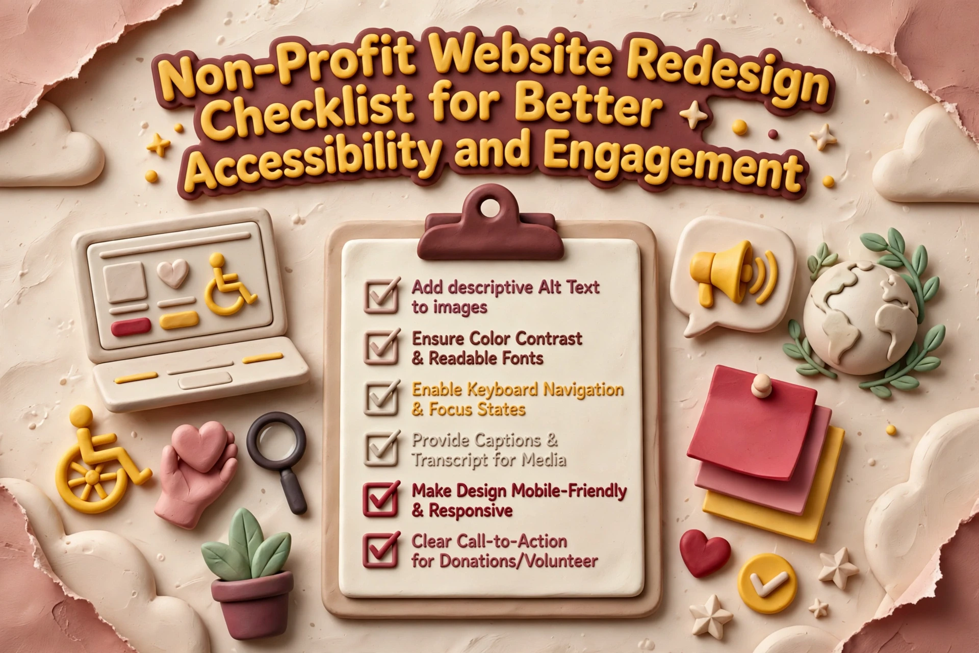
Check your key pages and interactions manually as well as with automated tools. Cover the homepage, navigation, donation pages, and contact forms. Confirm keyboard focus order, visible focus indicators, clear headings and labels, strong text contrast, and useful alt text for meaningful images. Automated scans help, but they are one input, not a full answer – pair them with human review.

Highlights
- Navigate key tasks, like giving, without a mouse
- Check focus order, form labels, headings, and contrast
- Include human review and a simple way for visitors to report barriers
- WCAG asks for at least a 4.5:1 text contrast ratio, so test your colors before launch
Pros
- Finds barriers that repeat across shared templates and affect many users
- Gives you concrete issues to fix and retest
Cons
- Automated scans alone cannot prove every user journey works
Internal pages fit: accessible web design can be tested during redesign. It ranks here because shared templates can block key actions site-wide, so test early.
Last updated: October 2, 2026
4. Clarify mission, audience paths, and calls to action
Make it clear who you serve and what each visitor can do next. Walk through your homepage as a donor, volunteer, and program participant would. Then give each one a clear path, like Donate, Volunteer, or Find Services.

Highlights
- Give the homepage a clear, audience-centered purpose.
- Use descriptive buttons instead of vague link text, such as specific calls to action tailored to each page.
- Build distinct routes for different visitor needs.
Pros
- Helps visitors understand the organization and available actions.
Cons
- Requires stakeholder input to prioritize audiences and avoid competing calls to action.
It ranks here because visitors cannot give or engage if they cannot tell what your organization does or where to go.
Last updated: October 2, 2026
More Checks to Complete Before and After Launch
Your donor and accessibility work covers the big stuff. These remaining checks keep the redesign solid long after launch day, especially for small teams managing the site themselves.
- Simplify navigation and page structure – Group pages around visitor needs, use clear labels, and keep main routes consistent.
- Use plain language and authentic impact content – Explain programs and results simply, and get permission for stories and photos.
- Build mobile-first, readable page layouts – Check legibility, tap targets, and speed on phones.
- Strengthen trust and donation-form consistency – Keep branding coherent and make giving and privacy info easy to verify.
- Protect URLs, search visibility, and integrations – Map redirects and test fundraising and email connections.
- Test forms, links, and confirmation messages – Run full checks on donations, sign-ups, and receipts.
- Prepare staff and content owners – Document publishing routines and assign responsibility.
- Review engagement and accessibility after launch – Schedule regular reviews of feedback, analytics, and key journeys.
How to prioritize your nonprofit redesign
Fix the tasks your visitors care about most first: giving, volunteering, and finding services. Then work through these checks:
- Test the donation journey early. Payment forms and third-party tools often carry their own accessibility and usability problems.
- Improve shared parts. Better navigation, headings, and form patterns lift every page at once.
- List what must survive. Note key pages, URLs, and integrations before you pick a new structure or platform.
- Assign owners. Someone needs clear responsibility for content, accessibility checks, analytics, and post-launch fixes.
Small teams rarely have staff for all of this. A done-for-you service like Monkey Business bundles design, hosting, maintenance, and support into one plan, so a lean nonprofit gets agency-quality work without hiring.

Ready to make your nonprofit site accessible and engaging? Monkey Business handles the whole redesign for you. Start today.
Frequently Asked Questions
Q1: Best nonprofit websites for fundraising groups?
Pick a platform with fast donation pages, clear buttons, and strong accessibility. Monkey Business builds done-for-you nonprofit sites with hosting, updates, and support included.
Q2: How much should a nonprofit website redesign cost?
Small nonprofits often spend $3,000 to $10,000, though subscription plans spread costs into affordable monthly payments.
Q3: How often should we update our website?
Review content monthly and plan a full redesign every three to five years.